Design Standards
This document outlines the design standards for OneStream solutions to ensure a consistent, user-friendly, and professional interface. It serves as a reference for developers, designers, and contributors involved in the development or maintenance of OneStream solutions.
Prerequisites
- You have access to the latest version of the OneStream development environment.
- You are familiar with the existing dashboard components
- You have reviewed any related documentation (e.g., OneCommunity or OneStream Documentation).
Dashboard Layout Types
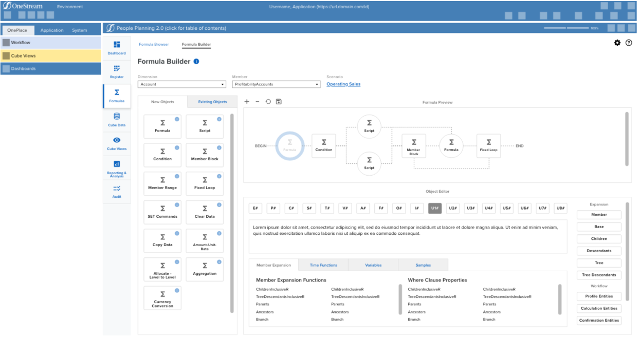
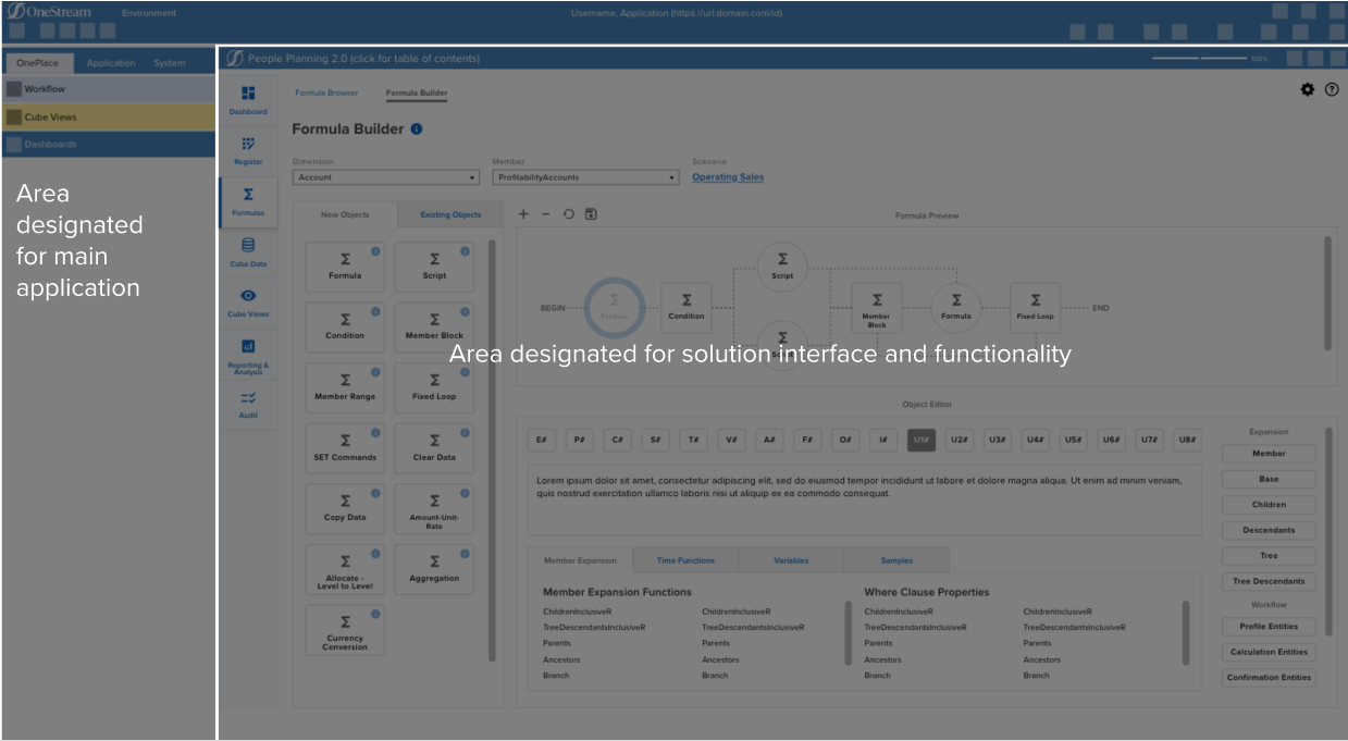
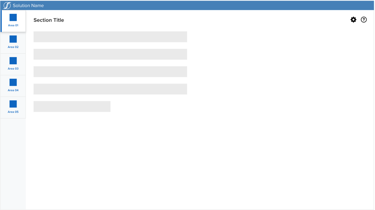
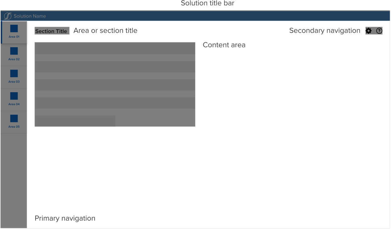
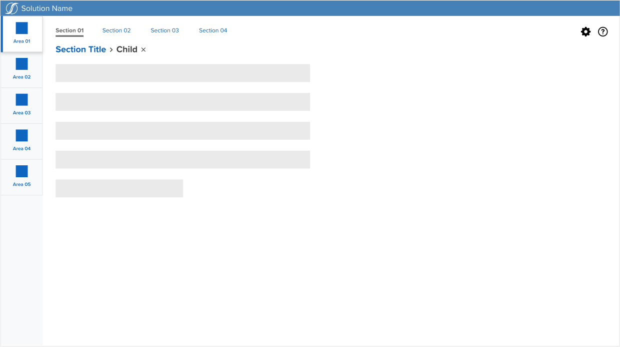
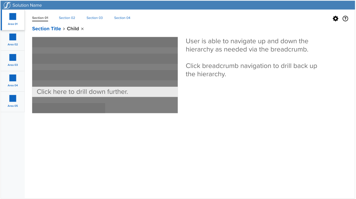
This section provides guidance on the structure and layout of dashboard components within the OneStream Windows application. Consistent layouts improve usability, reduce user confusion, and align with our internal UI/UX goals.
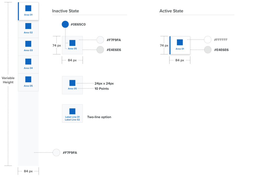
Include the following when designing or reviewing layouts:
- Standard placement of navigation panels, buttons, and headers
- Alignment and spacing rules between components
- Default measurements and colors
Note: Refer to the below screenshots for visual examples.
Color and Typography Guidelines
Define the standard color palette and font usage for the solution. Include:
- Approved colors for backgrounds, text, and UI highlights
- Font families and sizes for headers, labels, and solution content
Component Behavior and Interactions
Outline expectations for how components should behave in response to user interactions:
- Button states (default, hover, disabled)
- Modal and dialog window behavior
- Error handling and validation feedback