UI Design
UI Design encompasses two interfaces referred to as Modern Browser Experience (MBE) and Windows Application (WinApp). The Modern Browser Experience is defined as the Web (Edge, Safari, and Chrome), as well as support for tablets and phones.
Layout Structure
The following are general layout guidelines to provide a consistent visual framework for content and functionality within OneStream.
Core Elements
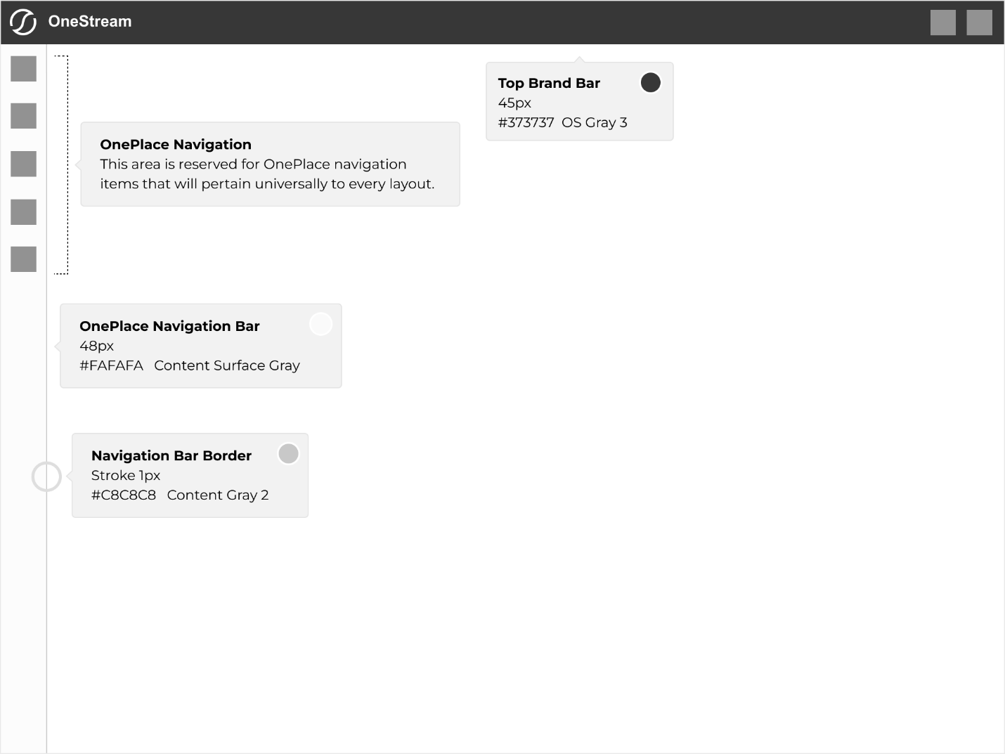
The top brand bar (header) and OnePlace Navigation Bar (sidebar) are critical elements of the platform's layout. They serve as primary navigational tools, providing users with quick access to key functions and ensuring an intuitive and consistent experience across all pages.
The application consists of core layout elements that will be present on every page of every view/section within. They are:
- Top header bar
- OnePlace navigation
- Navigation bar
These layout elements should always be consistent throughout the application and never deviate in any parameters, such as sizing or color. All iconography within the OnePlace navigation bar should be consistent and remain unchanged.
Margins & Padding
-
Padding is consistent on all four sides of the layout at 16 pixels.
-
Inner padding is 32 pixels (twice the main/outer padding).
-
There is a 30-pixel margin between the title and subtitle.
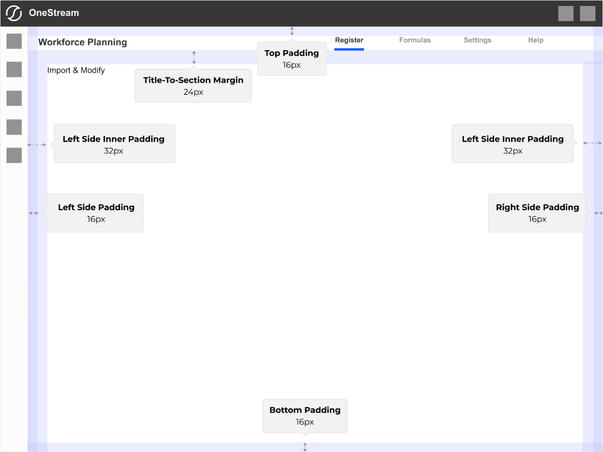
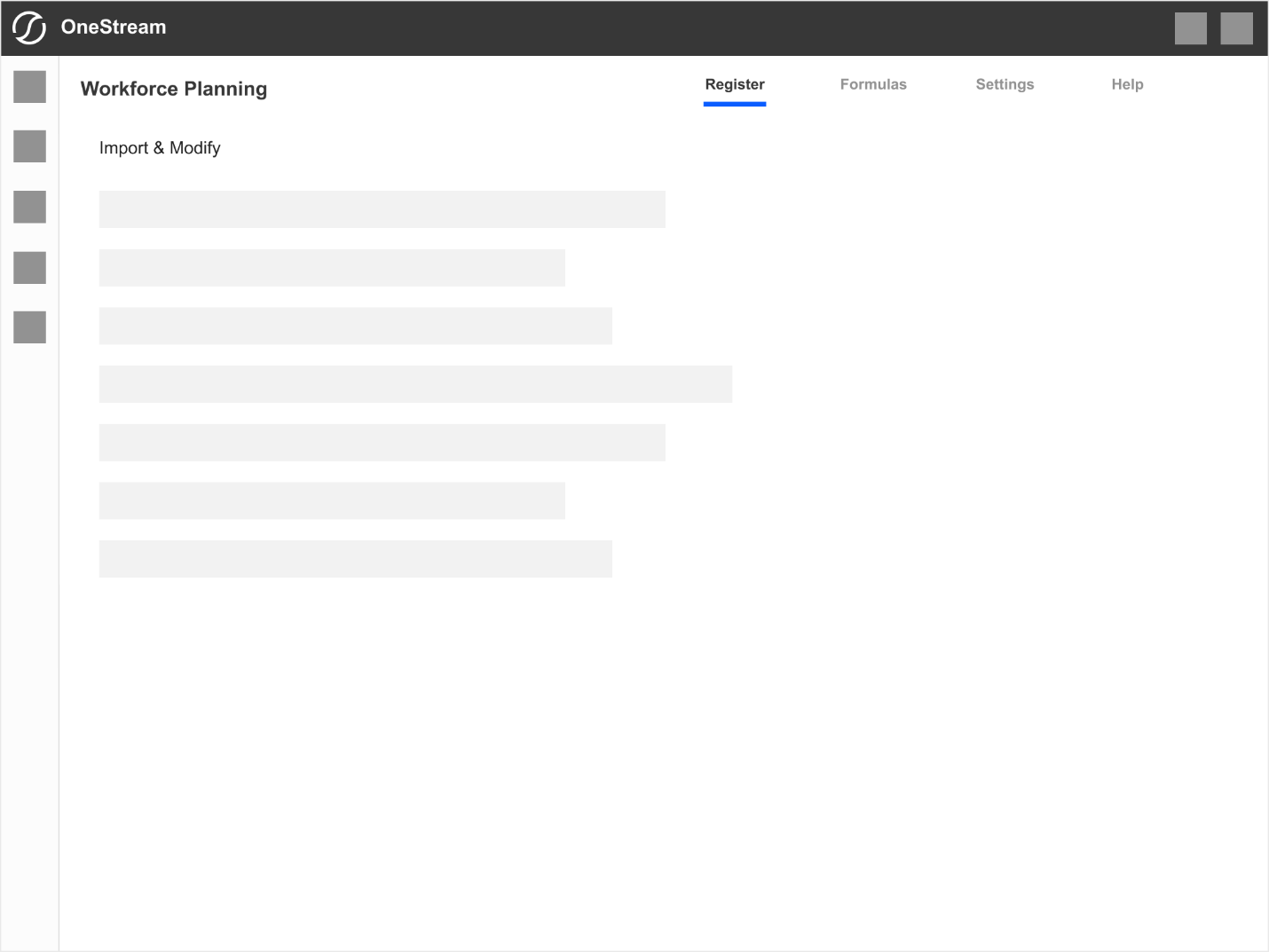
Example without guidelines.
Navigation
Basics
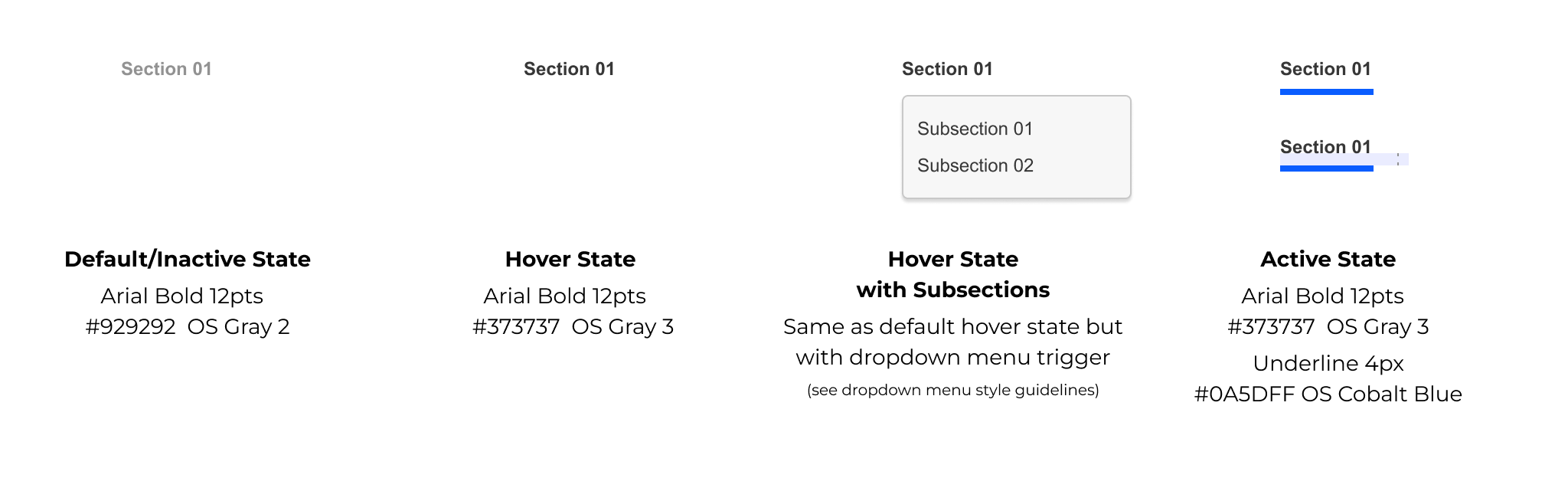
Primary & Secondary Styles
Dropdown Styles
Primary Navigation
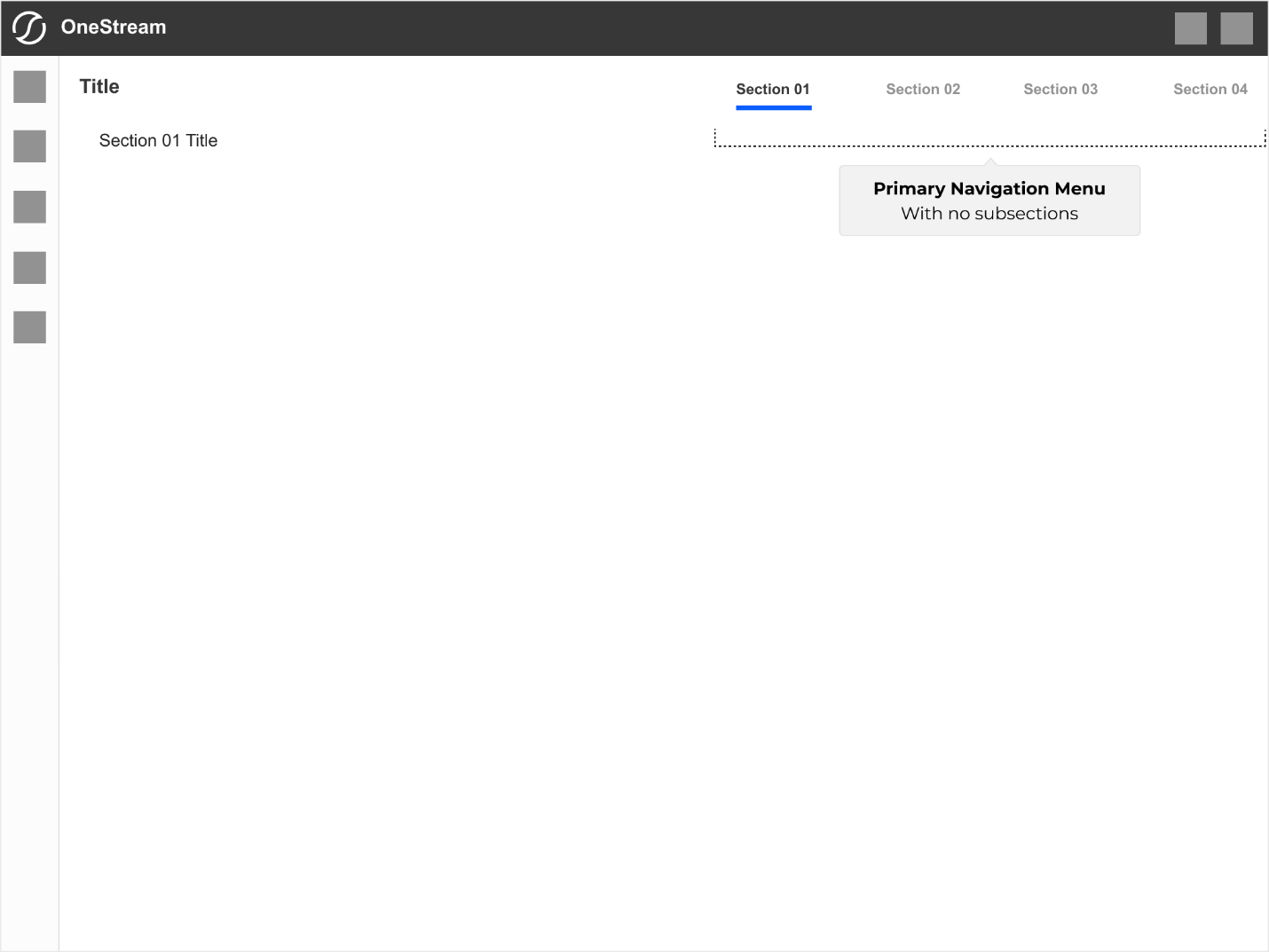
Without Subsections
This layout shows primary navigation with top-level sections. This is the simplest, single-level navigation pattern.
Section 01 Title reflects the currently active section accessed from the navigation.
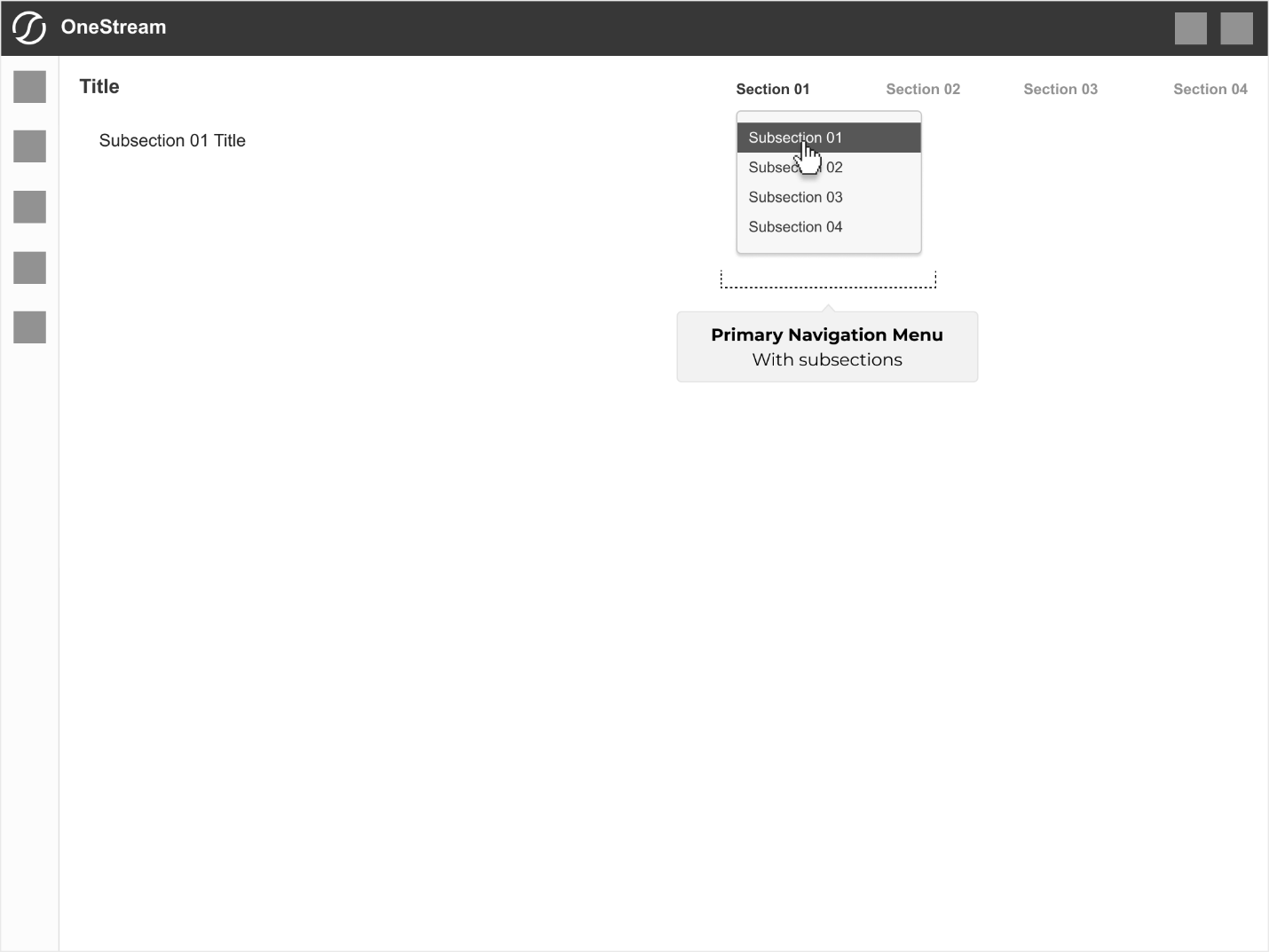
With Subsections
This layout reflects primary navigation containing any number of subsections. The top-level parent menu item becomes a rollover trigger for the subsection menu dropdown in this structure.
The title reflects the currently active subsection.
Note: Top-level menu items, when comprised of subsections, become a non-clickable entity and function only as a dropdown menu trigger.
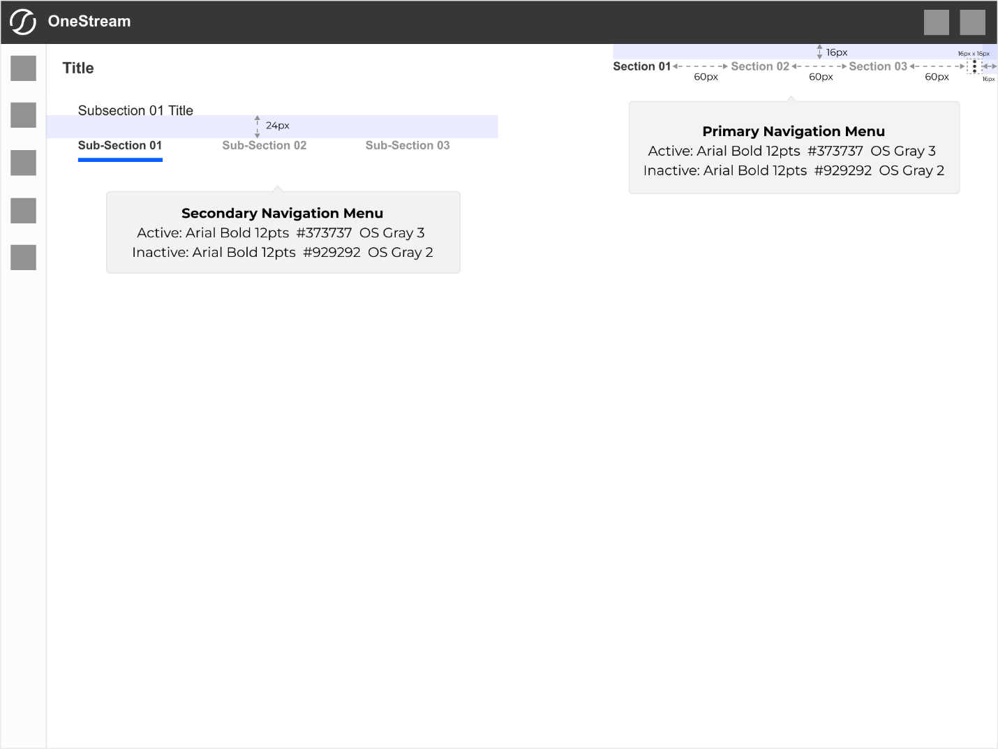
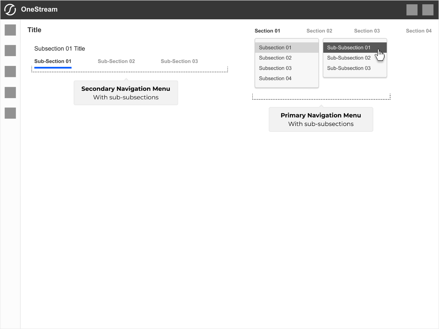
With Sub-Subsections
This layout reflects primary navigation containing any number of sub-subsections. In this structure, the top-level parent menu item and its submenu child item become roll-over triggers for the sub-subsection menu dropdown.
The title reflects the currently active parent subsection.
Secondary sub-sectional navigation activates and is visible at the top of the page.
Note: The top-level parent and submenu child items become non-clickable entities and function only as dropdown menu triggers.
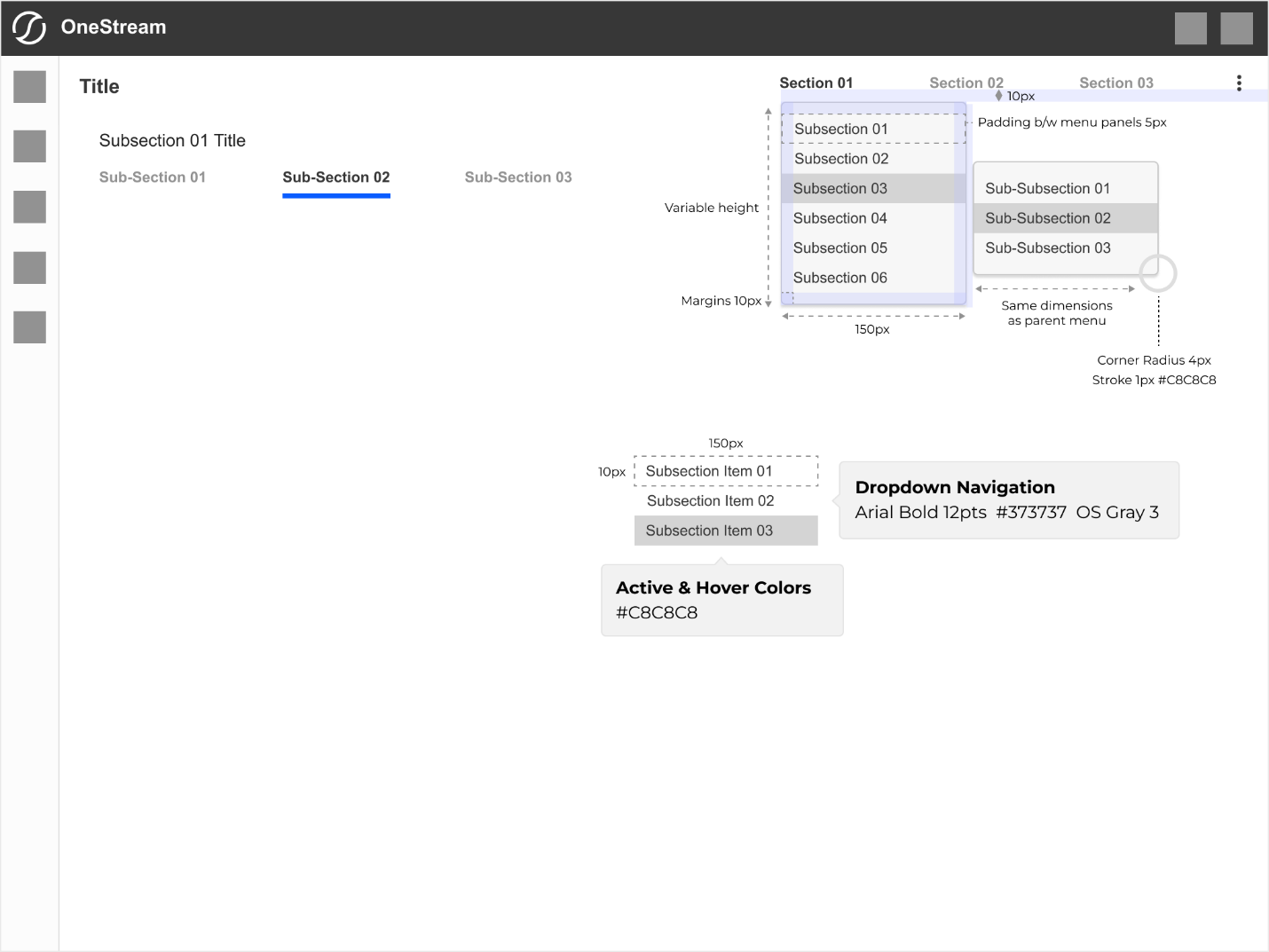
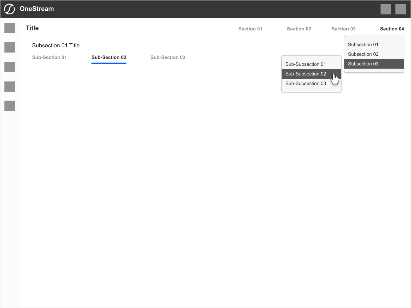
Right-Justified Navigation Dropdown
In an event right-most navigation section (in the example below Section 04) shall have subsections and/or sub-subsections its orientation shall change to be justified right to avoid running off the page.
Subsequent child dropdown menus shall open to the left (instead of standard right orientation).
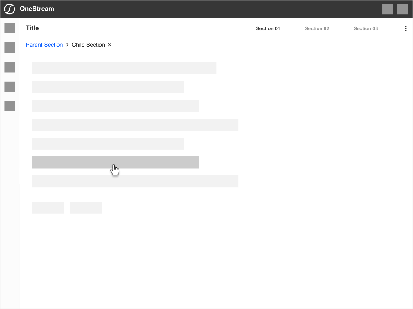
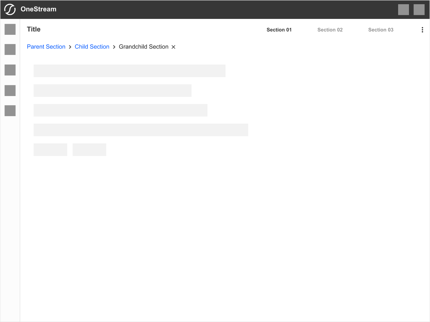
Breadcrumbs
Basics
Breadcrumbs Hierarchy - Child Section
Breadcrumbs Hierarchy - Grandchild Section
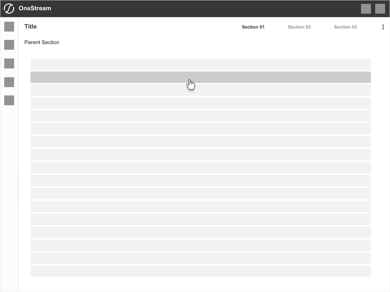
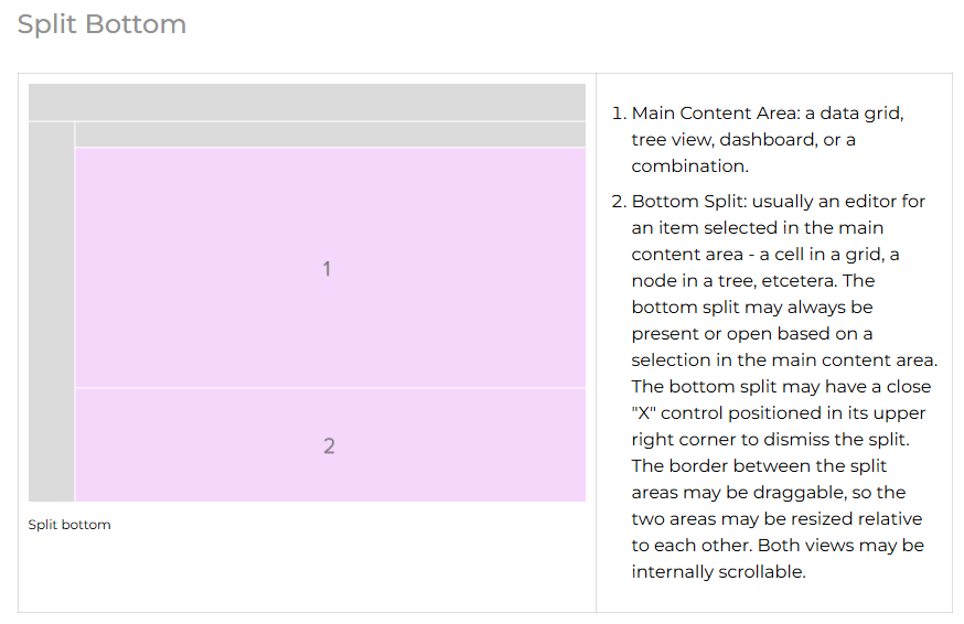
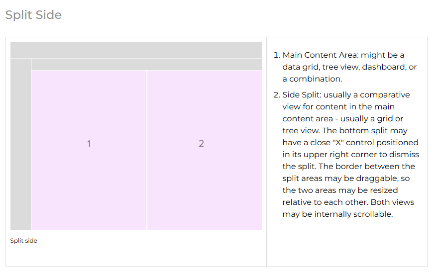
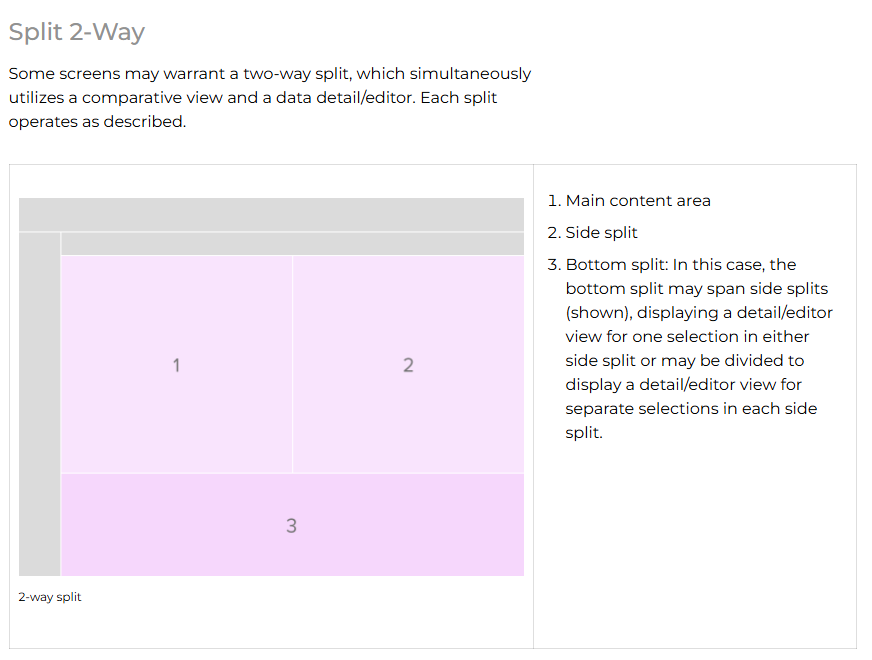
Split Views
Split views divide the workspace into two or more sections and can often be dragged to a size relative to each other. They differ from floating panels in that they take up room in the interface rather than overlaying content. Split views are often used to open a content editor (typically a split bottom) related to a selection in the main area, a comparative view (typically a split side), or both. There is usually only one split in either direction, but two may be possible on larger displays.
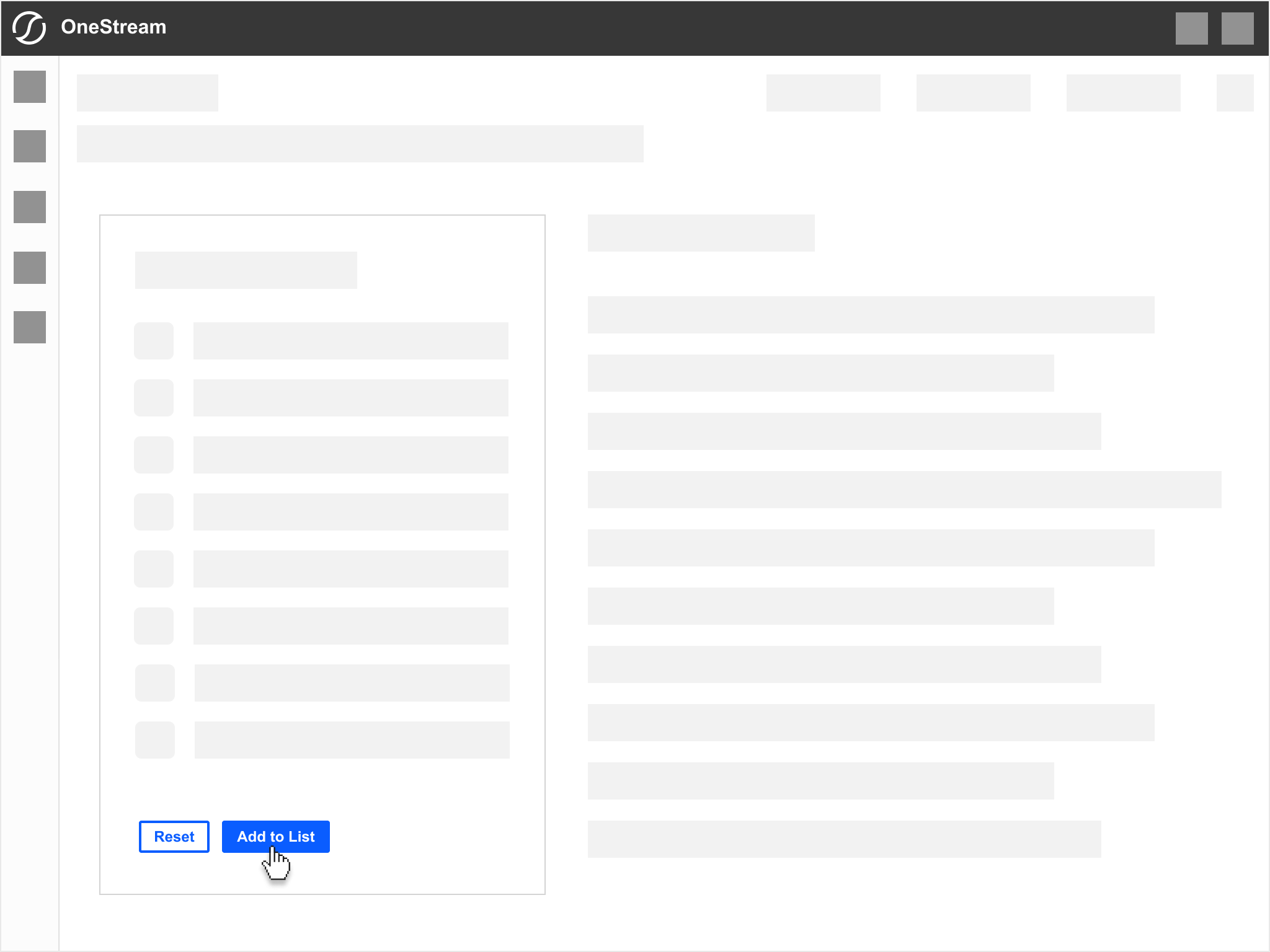
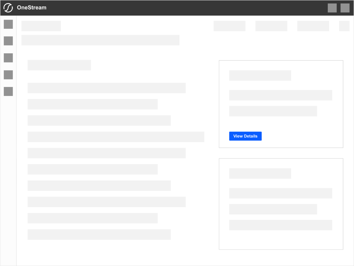
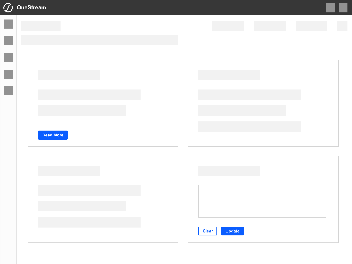
Buttons
Buttons are essential interactive elements that enable users to perform actions across the OneStream platform. Whether navigating between sections, triggering a process, or submitting data, buttons should be clear, accessible, and visually consistent.
Button Types
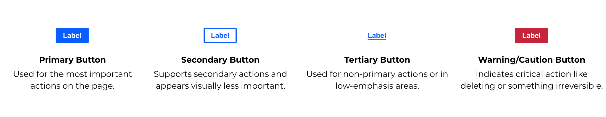
Primary Buttons
Primary buttons are the platform's most visually prominent CTAs (calls to action). They represent a user's most critical actions within a given interface. Due to their significance, primary buttons should be used sparingly to maintain their impact and avoid overwhelming the user.
Primary Button Usage
✅ A primary button should be used when:
-
The action is the main call to action (CTA) on the page
-
It represents the next logical step in the workflow
-
It is a high-priority action, such as "Submit," "Save," or "Confirm."
🚫 Do not use primary buttons:
-
For secondary or tertiary actions (use secondary or tertiary buttons instead)
-
Multiple items on the same screen unless necessary - this can dilute the emphasis on the primary action
-
When the action is destructive (use caution/warning button instead
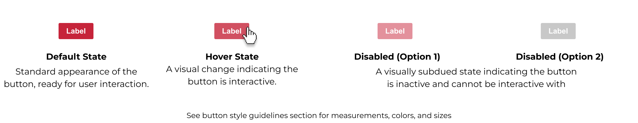
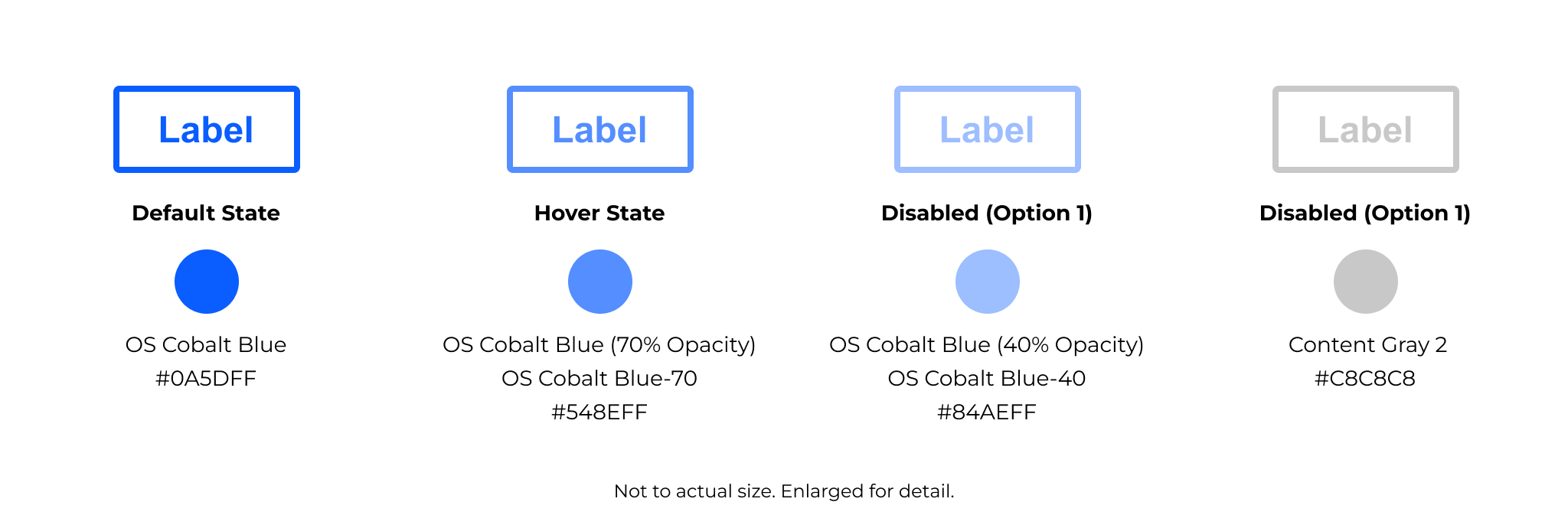
Secondary Buttons
Secondary buttons complement primary buttons. They are used for less critical actions where the primary button would be too visually dominant. While still interactive, secondary buttons have a more subtle visual treatment, ensuring the user's attention is drawn to the primary action first.
Secondary Button Usage
✅ A secondary button should be used when:
-
The action is necessary but not the primary call to action on a page
-
The button is an alternative to the primary action, such as "Cancel" next to "Submit."
-
The action is part of a secondary workflow that supports but does not replace the main task
🚫 Do not use secondary buttons:
-
As the main action when a primary button is necessary
-
For low-emphasis actions - consider a tertiary button instead
-
When the action is destructive - use a caution/warning button to clearly indicate the potential impact.
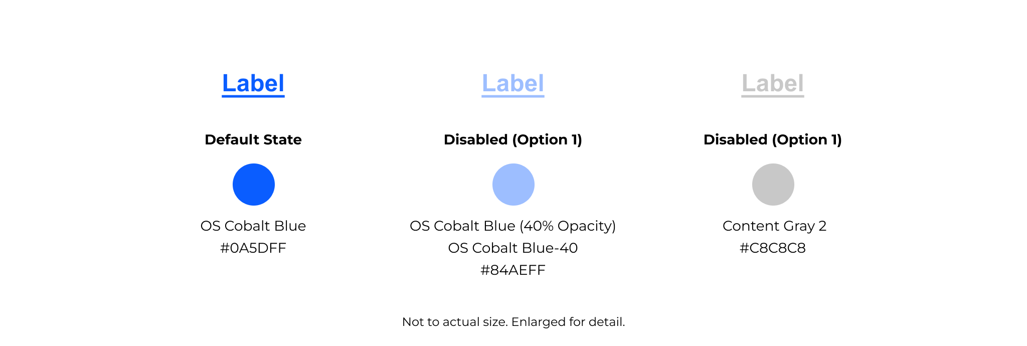
Tertiary Buttons
Tertiary buttons are the least visually prominent button type. They are designed for low-emphasis actions that are still interactive but do not require the attention of a primary or secondary button. Tertiary buttons are often used for supporting actions like "Learn more," "View details," or "Edit."
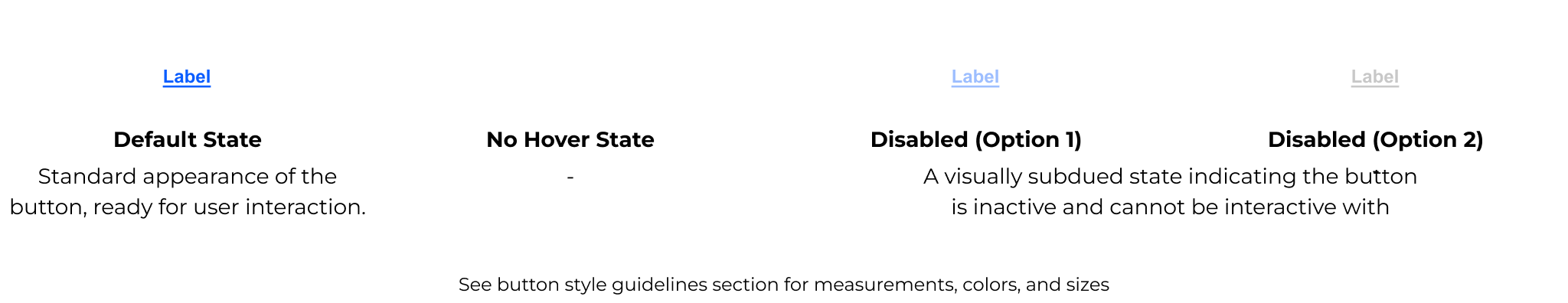
Tertiary Button Usage
✅ A primary button should be used when:
-
The action is not the primary or secondary call to action
-
The button represents a non-essential or supporting action in a workflow
-
Space is limited, and a button without a background fits the design better
-
The action needs to be available but should not distract from more critical actions
🚫 Do not use tertiary buttons:
-
For primary or high-emphasis actions - use a primary or secondary button instead
-
When the action needs strong visual contrast - tertiary buttons are intentionally subtle
-
For destructive actions - use a destructive button to make the impact clear
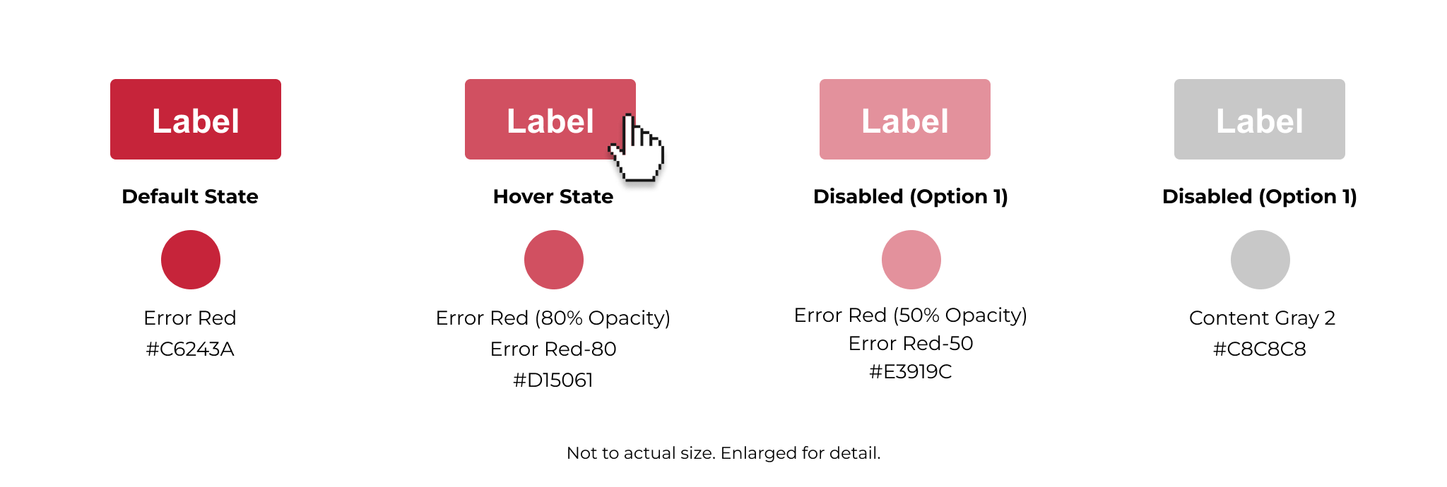
Caution or Warning Buttons (also known as Destructive Buttons)
Caution or warning buttons, also known as destructive buttons, are used for actions that have potentially harmful or irreversible consequences, such as deleting, removing, or permanently modifying data. Their distinct styling ensures users recognize the seriousness of the action and reduces accidental interactions.
Caution or Warning Button Usage
✅ A caution/warning button should be used when:
-
The action deletes, removes, or permanently alters data in a way that cannot be undone
-
The user must be warned about the impact of the action
-
The action requires intentional interaction, ensuring users do not accidentally trigger it
🚫 Do not use caution/warning buttons:
-
For routine or safe actions - use primary, secondary, or tertiary buttons instead.
-
When a confirmation dialogue is not needed, caution/warning actions should often include an extra confirmation step.
-
If the action is reversible, use a standard button instead.
Button Order
Buttons are essential interactive elements that enable users to perform actions across the OneStream platform. Whether navigating between sections, triggering a process, or submitting data, buttons should be clear, accessible, and visually consistent.
The order in which buttons appear plays a crucial role in usability and preventing accidental actions. In most cases, the primary action (Save, Submit, Confirm) should be positioned where users naturally expect it, while secondary actions (Cancel, Back) should remain visually accessible but de-emphasized.
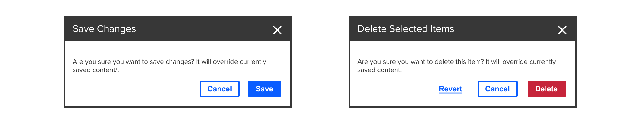
Standard Button Order
❗Note: this is an update to our current button order, which is in reverse.
Recommended button order to ensure clear prioritization.

The updated button order is left-to-right with secondary button on the left and primary button on the right as shown below:
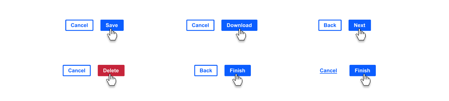
Primary, Secondary, and Tertiary Order
When primary, secondary, and tertiary buttons are used together, the primary button should always be the most visually prominent and positioned at the rightmost position.
The secondary button should be placed to the left of the primary button to indicate an alternative but less critical action. The tertiary button, being the least emphasized, should be positioned farthest from the primary action, furthest to the left.

Best Practices for Button Order
✅ Do:
- The action is the main call to action (CTA) on the page
🚫 Don't:
- For secondary or tertiary actions (use secondary or tertiary buttons instead)
Button Placement
Proper button placement is crucial for usability, efficiency, and guiding users through workflows. Buttons should be positioned where users naturally expect to find them, ensuring that actions are clear, accessible, and easy to interact with.
Effective placement reduces friction and improves the user experience by making actions intuitive and reducing cognitive load.
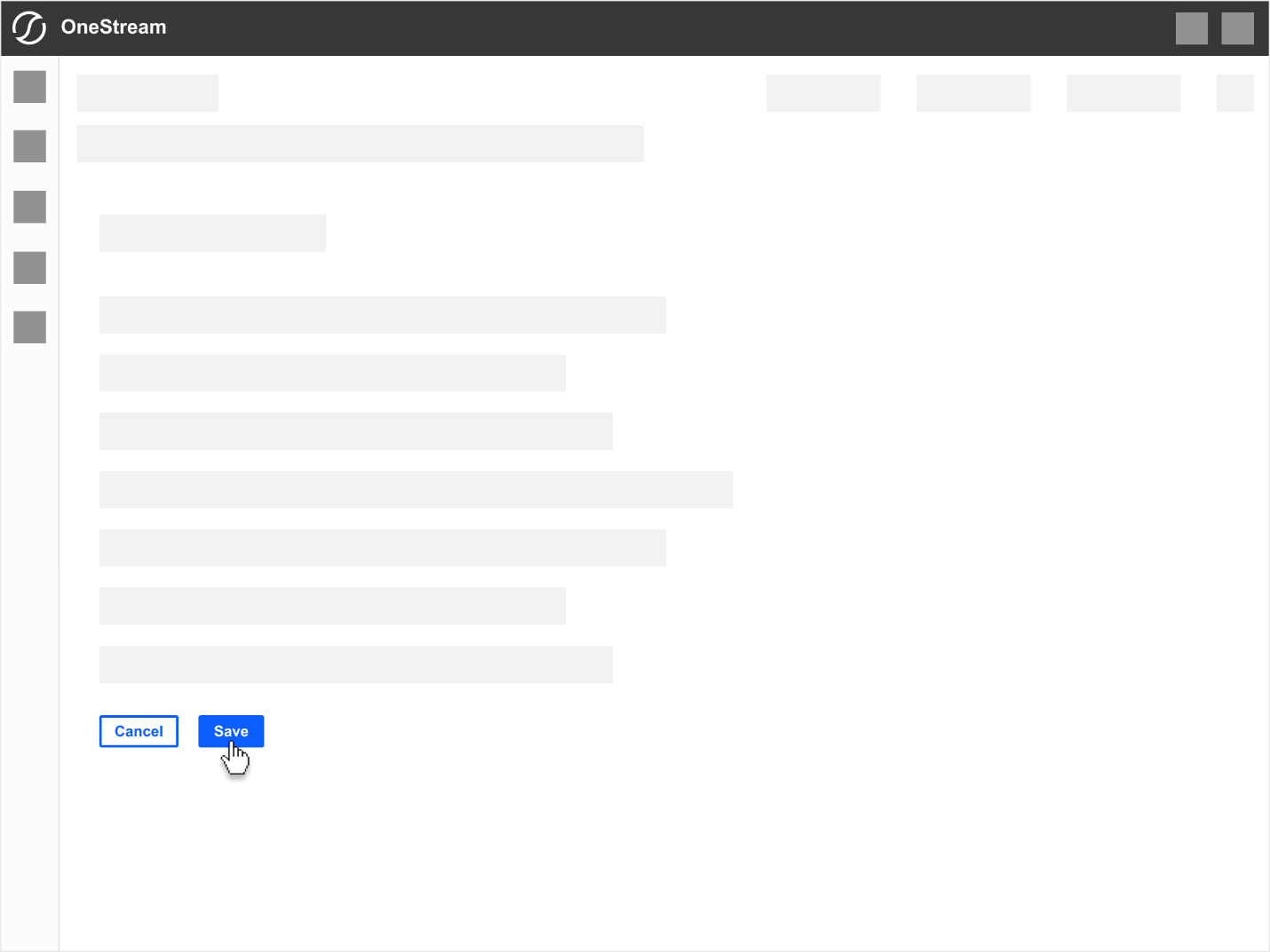
General Content & Forms (Bottom Left)
Submitting forms, completing a workflow, or confirming actions.
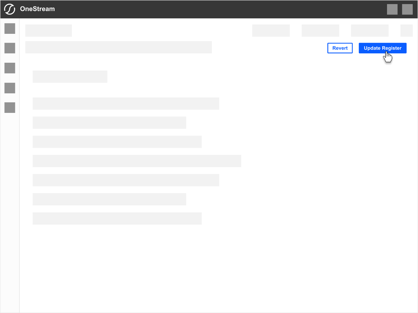
Persistent Page-Level Controls (Top Right)
Actions that affect entire page such as "Update", "Submit", "Export"
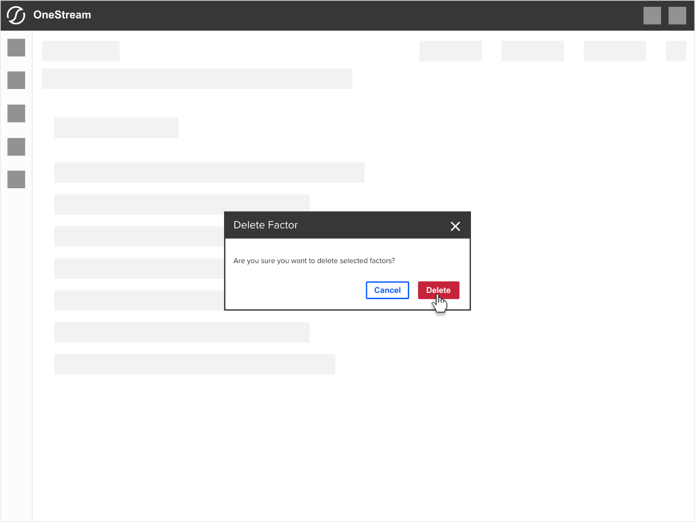
Modal Overlays, Dialogue Boxes & Various Popups (Bottom Right)
Side Panels, Slide-Out Panels, Tiles & Modules
As a general guideline for all self-contained areas such as panels, tiles, modules that function as a an area to perform
Side Panel (Left & Right)
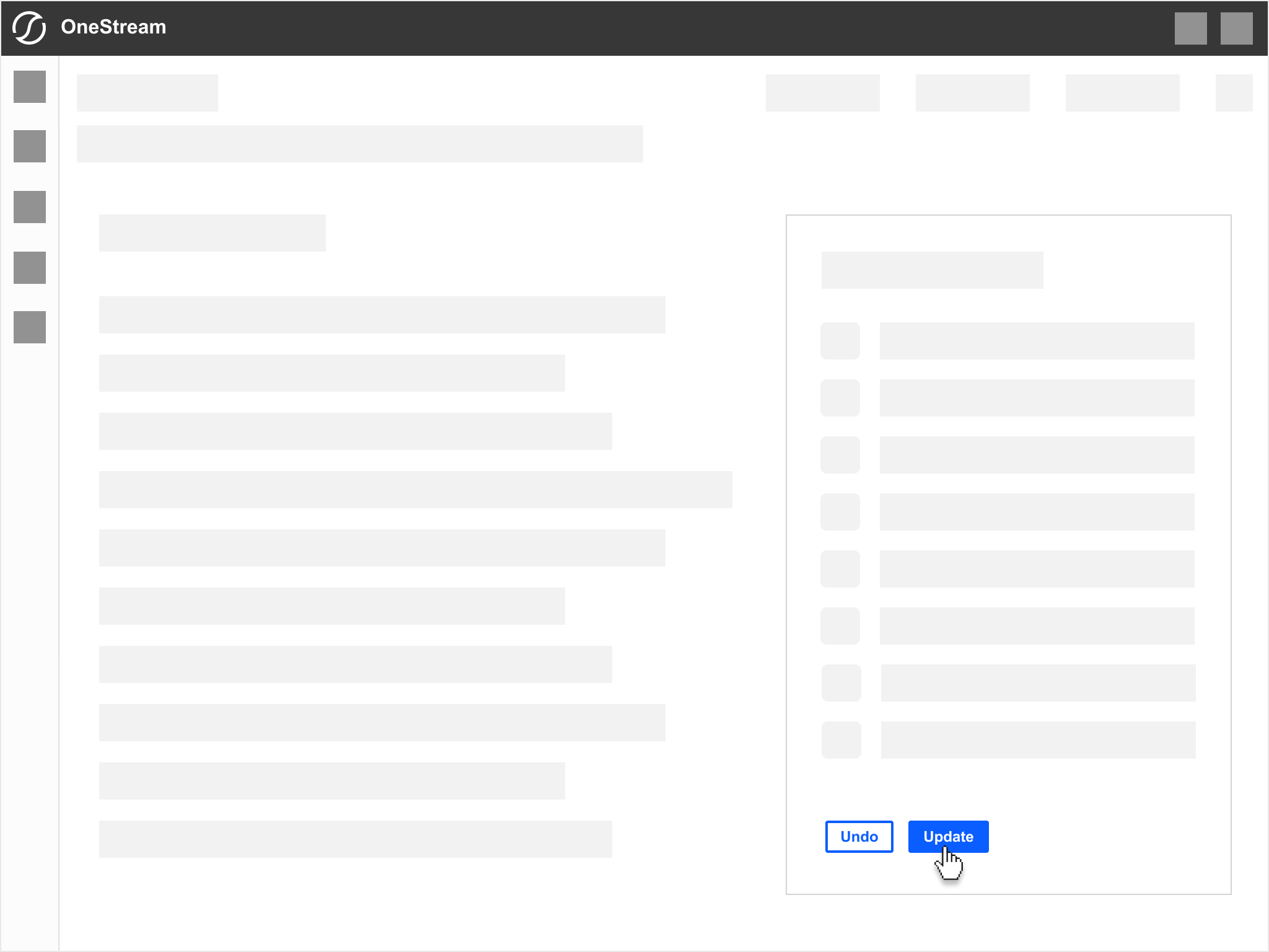
Tiles & Modules
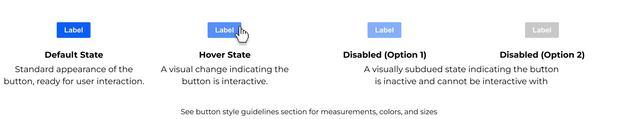
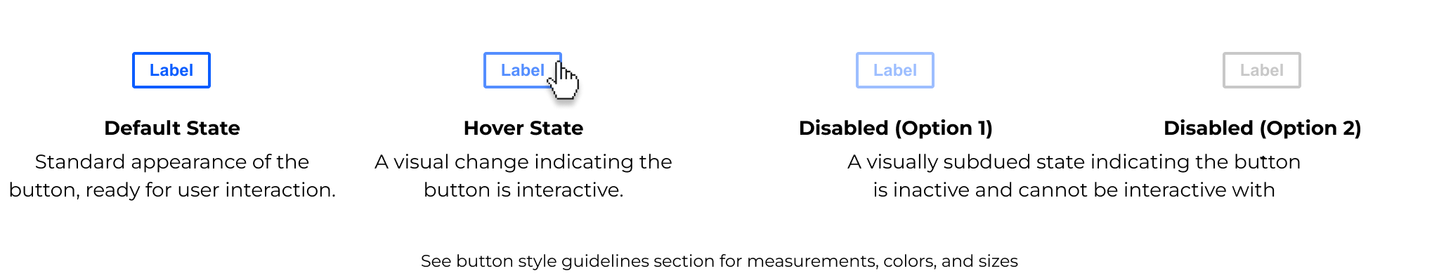
Button Styling
Consistent button styling is essential for maintaining a cohesive user experience across OneStream platform. This section defines the visual specifications for all utilized button types to ensure they adhere to a unified design language.
Key Styling Elements
-
Size & spacing
-
Typography
-
Colors (see Button Colors section)
-
Corner radius
-
Border stroke
-
Hover & active states (see Button Colors section)
-
Disabled states (see Button Colors section)
Size & Spacing
This section defines button's core visual attributes: padding, corner radius, border stroke, and font style. These styles contribute to button's clarity, usability, and accessibility.
-
Padding: Button has balanced horizontal and vertical padding to maintain comfortable clickable area.
-
Corner radius: a subtle corner radius of 2px provides softer and approachable look.
-
Border stroke (secondary button only): primary and tertiary buttons have no border, while secondary buttons use a 2px stroke.
Button Margins
When buttons are placed next to each other, proper spacing ensures clarity, ease of interaction, and prevents accidental clicks. A uniform margin of 24px should be maintained between adjacent buttons to provide visual separation.

Typography
Buttons in OneStream platform use Arial Bold, 12px as the standard typeface. Underline variation is used for tertiary-styled buttons.
Guidelines
-
Font family: Arial, sans-serif
-
Font size: 12px (base size for all button types)
-
Font weight: Bold (ensures clarity and visibility, especially on smaller screens)
-
Text case: sentence case example "Upload Data" , not "UPLOAD DATA"
-
Alignment: center-aligned within the button to maintain visual balance.
-
Letter spacing: use default spacing, avoid wide tracking that can make text appear stretched or awkward.

Button Corner Radius & Border Stroke
A consistent corner radius - of 2px provides a modern and approachable look while maintaining with OneStream's design language.
Primary or warning/caution buttons do not have a border, while secondary buttons use a 2px stroke for clear differentiation.

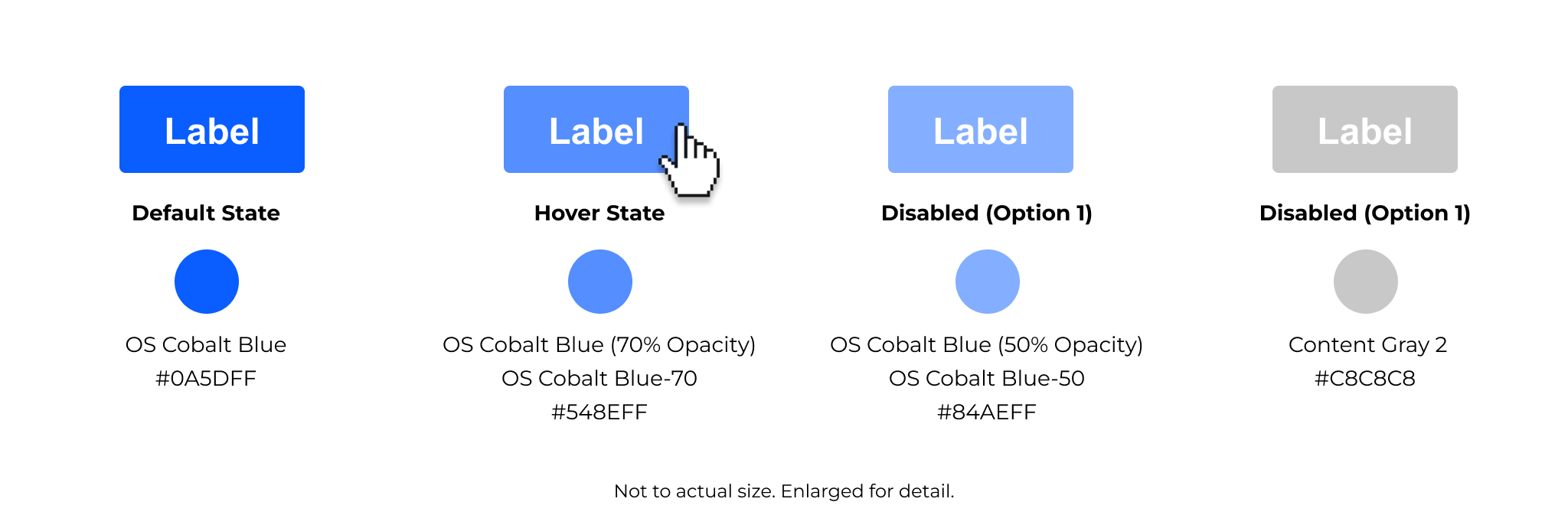
Button Colors
Button colors are chosen to reflect action hierarchy, brand consistency, and accessibility standards. Each button type - primary, secondary, tertiary, and caution - uses a distinct color scheme to help users quickly identify the purpose and importance of an action.
Primary Button Color Palette
Secondary Button Color Palette
Tertiary Button Color Palette
Note: Tertiary button does not have a hover state.
Caution & Warning Button Color Palette