Organizing YourDashboard Structure
When setting up a solution, it is important to ensure that you maintain an organized dashboard structure within your workspace. The best way to do that is to make proper use of Maintenance Units and Dashboard Groups.
Maintenance Units should be used to separate larger pieces of functionality within your solution if necessary.
Dashboard Groups should be used within Maintenance Units, to help organize your dashboards, and separate the main pages within that area of functionality.
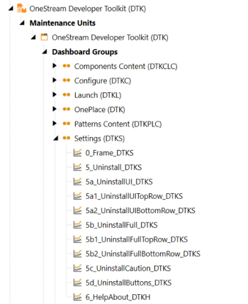
By following this structure and keeping your dashboards organized, it will allow for much easier development and debugging.
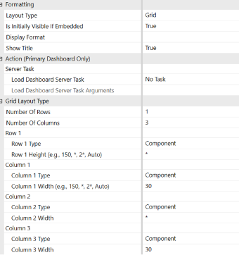
Dashboard Layouts
When structuring an individual dashboard you have the choice between these eight main layout types:
-
Canvas (Windows App Only)
- Each item specifies its left, top, width, and height settings
-
Dock (Windows App Only)
- Each item specifies its dock position (Left, Top, Right, Bottom) and either Width or Height.
-
Wrap (Windows App Only)
- Each item specifies its size, and the layout container wraps them.
-
Grid
-
The Dashboard object defines rows and columns based on a XAML Grid class. The component items' size and position properties are ignored.
-
-
Vertical Stack Panel
- Grid with one column and at least 1 row. The component items' size and position properties are ignored.
-
Horizontal Stack Panel
- Grid with one row and at least 1 column. The component items' size and position properties are ignored.
-
Tabs
- Each item is in its own tab. The component items' size and position properties are ignored.
-
Uniform
- All items are the same size. The component items' size and position properties are ignored. Also, if the Toggle Component Size button is used, the dashboard is rendered using Uniform layout type.
For each layout it is important to note the order in which you embed components within the dashboard, as that directly corresponds to the order in which they are displayed.
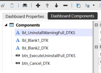
Items can be added, removed, or re-ordered within the dashboard using the +, -, ↑, and ↓ buttons shown above.