Combo Boxes
What is a Combo Box Component?
A Combo Box component in Windows Presentation Foundation (WPF) applications is a versatile control that allows users to select an item from a list of options or enter a custom value. It is essentially a combination of a text box and a drop-down list, providing both functionality in a single UI element. The list is shown and hidden as the control expands and collapses. In its default state, the list collapses, displaying only one choice. When expanded, it shows the complete list of options with additional muti-select features capable.
When to use
The Standard Combo Box is a fundamental UI component, offering a compact and efficient way for users to make selections from a list or enter custom information. It is best used when dealing with many options or when space is at a premium.
- Large List of Options: Use a Combo Box when you have more than 15 choices, as scrolling through a long list can be cumbersome for users.
- Editable Choices: When you want to allow users not only to select from a list but also to type a custom value, a Combo Box is appropriate.
- Limited Space: A Combo Box is useful when screen real estate is limited, as it takes up less space compared to a List Box that shows all items at once.
- Autocomplete Functionality: If you want to provide an autocomplete feature where the control filters out options based on user input, a Combo Box is suitable.
Examples:
- Populate a combo box with different parameter types showing the flexibility of data binding options within the parameters set.
- Pass a selected value to a reporting component in a dashboard. Show the combo box in a toolbar with a dashboard beneath it with a refresh action.
- Understand how to use multiple selected keys and values from a combo box to bind them to a Process
When not to use
- Small Number of Options: For a small set of options (typically fewer than 15), consider using simpler controls like radio buttons or a picker
- Not as a Menu: Do not use a Combo Box as a generic menu component. If you need to create overlays for actions, use a Menu Bar component instead.
- Within a Popover: Avoid using a Combo Box within a popover, as it can be confusing for users.
Standard Properties
Formatting
| Property | Description |
|---|---|
| Name | Unique identifier for the combo box. |
| Width/Height | Size of the combo box. |
| IsEditable | Indicates whether the text box portion of the combo box is editable. |
| IsEnabled | Specifies whether the combo box is enabled or disabled. |
| IsReadOnly | Indicates whether the text box portion of the combo box is read-only. |
| Multi-Select | Allow for multiple values from the list to be selected. |
| Show Search | Allow for search object to be enabled for better user experience in a longer list of values. |
Actions and Events
- Selection Changed Event
- The
SelectionChangedevent is raised when an item is selected from the list. We can handle this event to update the display or perform other operations based on the selected item.
- The
- Text Changed Event
- When the user modifies the text in the combo box, the
TextChangedevent occurs. We can use this event to validate or filter the text, such as providing auto-complete or search suggestions.
- When the user modifies the text in the combo box, the
Combo Box Types
Other than the standard combo box above, there are a few other types you can use:
Bound Data Combo Box
In many applications, a Bound Data Combo Box is essential for efficiently managing dynamic selections that change based on user input or external data sources. This type of combo box enables developers to streamline the user interface, ensuring that the options presented are always up-to-date and relevant to the context of the task at hand.
What is a Bound Data Combo Box?
A combo box from a bound data list populates the selections within the combo box from a dataset.
The selections within the combo box are dynamically updated based on the data retrieved from the bound dataset, making the interface more intuitive and responsive to user actions. This process involves creating a Parameter of type Bound List to store the results from a Method Query or an SQL statement, which is then attached to the Combo Box.
It is recommended to utilize a method query to retrieve the bound list data as it is easier to maintain changes to the query as well as ensuring that any parameters used in the query are resolved, avoiding runtime errors.
Usage
The implementation of the bound data list Combo Box that follows can be found in the assemblies of the Developer Toolkit (see the below GetAnimalNames() method).
- C#
- VB
namespace BoundData
{
  public static DataTable GetAnimalNames(SessionInfo si)
  {
    try
    {
      List<string> animals = ["Cat", "Dog", "Bird", "Fish"];
      string tableName = "AnimalNames";
      DataTable dt = new(tableName);

      dt.Columns.Add("Name", Type.GetType("System.String"));

      foreach (string animal in animals)
      {
        DataRow dr = dt.NewRow();
        dr["Name"] = animal;
        dt.Rows.Add(dr);
      }

      using DataView dv = new(dt);
      dv.Sort = "Name";
      using DataTable dtSorted = dv.ToTable();
      dtSorted.TableName = tableName;
      return dtSorted;
    }
    catch (Exception ex)
    {
      throw ErrorHandler.LogWrite(si, new XFException(si, "Unhandled Exception in GetAnimalNames() function.", ex.Message, ex.InnerException));
    }
  }
}
Public Shared Function GetAnimalNames(ByVal si As SessionInfo) As DataTable
	Try
		Dim animals As New List(Of String) From {"Cat", "Dog", "Bird", "Fish"}

      Dim tableName As String = "AnimalNames"
		Dim dt As New DataTable(tableName)

		dt.Columns.Add("Name", Type.GetType("System.String"))

		Dim animal As String
		For Each animal In animals
			Dim dr As DataRow = dt.NewRow()
			dr("Name") = animal
			dt.Rows.Add(dr)
		Next

		Using dv As New DataView(dt)
			dv.Sort = "Name"
			Return dv.ToTable(tableName)
		End Using


	Catch ex As Exception
		Throw ErrorHandler.LogWrite(si, New XFException(si, "Unhandled Exception in GetAnimalNamesCType(function.", ex.Message, ex.InnerException,)))
            End Try
End Function
The following steps will provide insight into how to implement a Bound List parameter type and how to bind that list to a Combo Box component. Example will show how to retrieve the selected value from the Combo Box and pass that selected value to a method within an assembly file or simply read the parameter value directly to use with another OneStream component type.
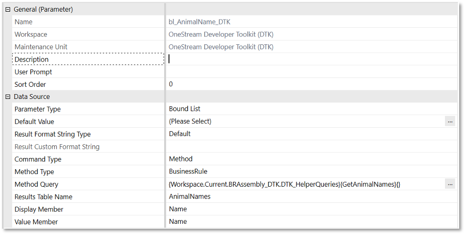
First, create a bound list parameter that will be populated with data from the GetAnimalNames() method query. The result returned will be a data table object named AnimalNames with two columns (for display and value). In this example, both columns are populated with the same data: Name.
Actions
Here’s what the combo box from a bound data list action should be set to for successful implementation. Notice that when creating the Combo Box component, the Bound Parameter is set to the parameter that was created in the previous step. In this simple example, there is no implementation other than a dashboard refresh that occurs when a value is selected from the Combo Box. By specifying the Selection Changed Server Task, a method call can be invoked from a workspace assembly or legacy business rule, where the selected value from the Combo Box (|!bl_AnimalName_DTK!|) can be passed to a method to perform an operation.
When passing the parameter value to a method, the parameter can be passed in one of two ways:
|!!| - will pass the parameter’s value
|| - will pass the parameter’s name
However, since both value and name have been defined with the same value, as noted above, using either syntax in this example will produce the same result.
Multi-select Combo Box
A multi-select combo box allows a user to select multiple items by selecting one or many of their corresponding check boxes. This component is useful when multiple options need to be chosen from a list. To implement this type of combo box, create a Bound List parameter that stores the results of a Method Query, then attach the parameter to the combo box.
Usage
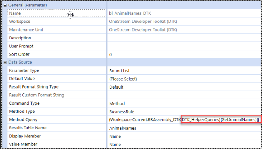
The multi-select combo box implementation is provided within the Developer Toolkit assemblies. For reference, review the GetAnimalNames method in DTK_HelperQueries.cs.
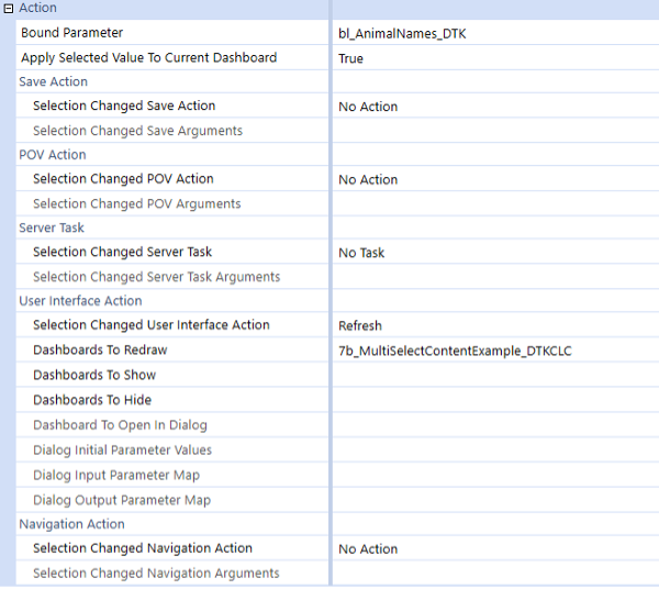
Actions
Below are the recommended settings for the multi-select combo box action to ensure successful implementation.
Delimited List Combo Box
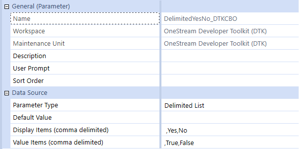
A Delimited List Combo Box is a drop-down control (Combo Box) whose options are derived from a Delimited List parameter. The Delimited List parameter stores all available values to be displayed, along with the currently selected item. Once the parameter is defined, a user simply assigns the parameter to the combo box in the Bound Parameter property, and the Delimited List Combo Box renders both the list and the current selection.
Data Source Properties
- Default Value: The value automatically assigned to the parameter if the user makes no selection.
- Display Items (comma delimited): The list of items rendered in the Combo Box, visible in the dashboard component.
- Value Items (comma delimited): The list of corresponding values behind each Display Item. When a user selects a Display Item, its paired Value Item is stored in the parameter.
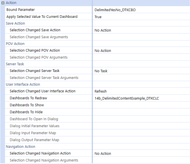
Action Properties
- Bound Parameter: Specifies the name of the parameter that this combo box is tied to. Piped-variable name syntax cannot be used here. The component pulls its option list from this parameter’s Display Items. When the user makes a selection, the Display Item’s corresponding Value Item is updated for the parameter itself, and for any piped‐variable references to the parameter elsewhere.
- Selection Changed User Interface Action: Set this property to Refresh to reload the dashboard(s) specified in the Dashboards to Redraw property, which makes a connection back to the database to acquire all new data.
- Dashboards To Redraw: A comma-separated list of embedded dashboards to redraw when the user changes the selection in the Delimited List Combo Box component.