Buttons
What is a Button Component?
The Button component is a fundamental user interface (UI) element used in various developer toolkits, including Windows Presentation Foundation (WPF) for desktop applications. It is designed to initiate specific actions, making it important to define button label text that clearly indicates what action will occur when the user interacts with it on a page.
A button can be set to several button types:
When to use
The Button component is used to present actionable options to users and enable interaction with a page. In most cases, each dashboard will have one primary button (such as a Save button), while any additional buttons would be secondary or tertiary.
Below are some scenarios where buttons can be particularly valuable:
- Save Button: Add a save button on a simple modal dashboard form displaying a grid component, allowing for the validation and processing of data that is input into the grid.
- Navigation Buttons: Utilize buttons to facilitate user navigation between various pages or sections of your application, employing a consistent left-hand navigation bar pattern.
- Action Buttons: Implement action buttons that initiate defined processes upon activation. For instance, include a button on your dashboard page to execute a series of data management tasks.
Bonus: Learn how to control and customize your task progress bar to enhance the user experience.
When not to use
While the Button component is versatile, it's important to avoid overuse as too many calls to action can overwhelm and confuse users.
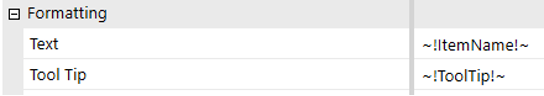
Formatting
Key settings affecting a button’s appearance and behavior include size, state colors, alignment, and visibility. Adjusting these properties can significantly impact user experience and system behavior.
Actions and Event Processing
Examining the influence of the button's behavior in different scenarios, such as its response to various server task types for processing performance or how different user interface actions impact task navigation and event handling.
Button Types
It is important to understand the types of buttons to use and their impact on system behavior.
Standard Button
A standard button represents a generic button control that can be assigned custom functionality, such as displaying a dashboard, executing a business rule or calling a method from an Assembly.
Properties
The button offers numerous properties and actions that can be configured, providing significant flexibility in functionality. These properties can be set as a simple text, can be bound to parameters or to variables in a class model.
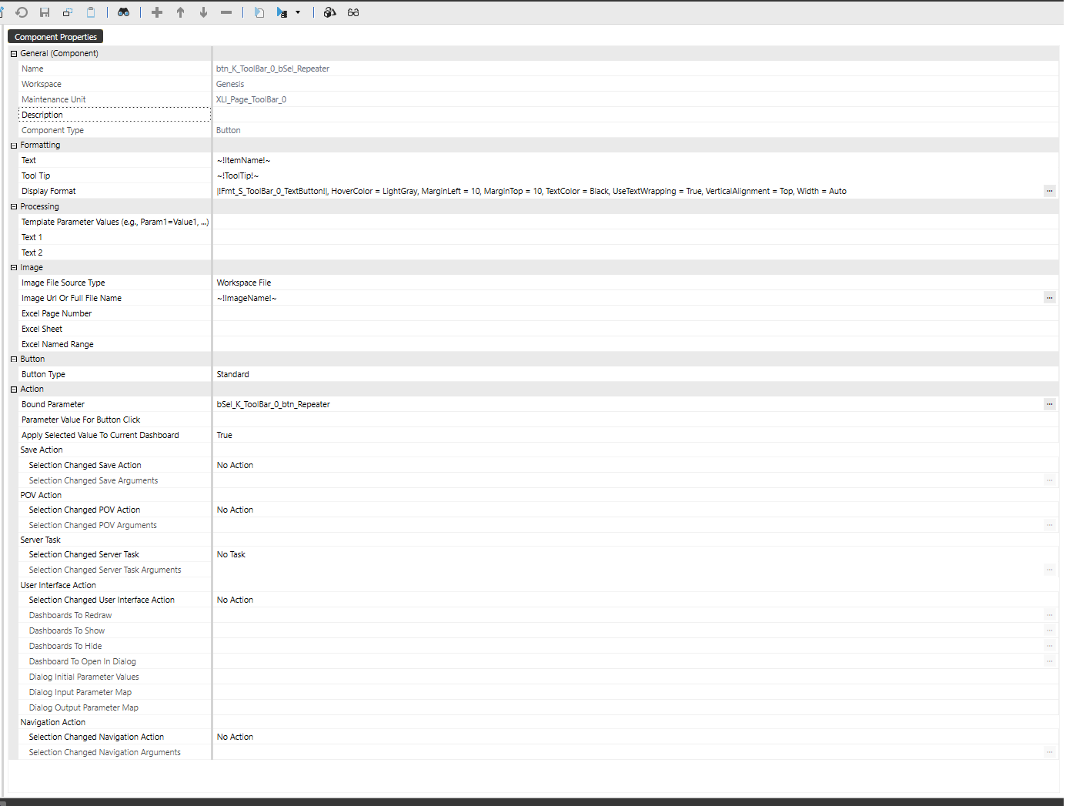
Formatting
The properties can be a simple text, a value from combo box, a parameter, or variables from classes.
For instance, if we have a ButtonModel class with public variables, these can be assigned to the button's properties, such as Text, ToolTip, ImageName, etc.
The syntax to use is: ~!VariableName!~
public class ButtonModel
{
    public string ItemType { get; set; } = "Button";
    public string ItemId { get; set; } = string.Empty;
    public string ItemName { get; set; } = string.Empty;
    public string ItemLabel { get; set; } = string.Empty;
    public string ImageName { get; set; } = string.Empty;
    public string ToolTip { get; set; } = string.Empty;
    public string PovAction { get; set; } = string.Empty;
    public string ServerTask { get; set; } = string.Empty;
    public string ServerTaskArgs { get; set; } = string.Empty;
    public string UIAction { get; set; } = string.Empty;
    public string Dashboard { get; set; } = string.Empty;
    public string Dialog { get; set; } = string.Empty;
    public string NavAction { get; set; } = string.Empty;
    public string NavArgs { get; set; } = string.Empty;
    public string Order { get; set; } = "0";"
}
Display Format
Custom Parameters
The parameter specified for this property will control the button’s appearance, color, font, size, etc.
This is an example of settings that can be configured:
BackgroundColor = |!Fmt_AppNavBarButton!|, BorderColor = Transparent, Height = 30, HorizontalAlignment = Left, HoverColor = |!Clr_AppNavBarButtonIndicatorBackground!|, FontFamily = |!Fnt_SystemFont!|, TextColor = White, VerticalAlignment = Center, Width = 80
These settings can be configured to use parameters which values can be changed in an interface or by some logic in the code.
In addition to the default settings, the properties below can be configured, and it will overwrite the default settings:
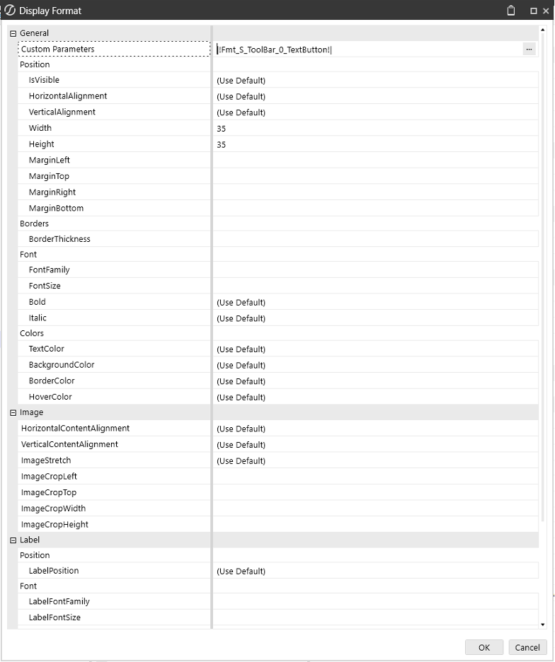
The Width can be set to Auto and the button size will adjust automatically depending on the Text.
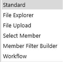
Types
Button Type can be configured for several actions, as shown in the picture below:
The button can be bound to a parameter where input values can be configured.
Do not use piped variable name
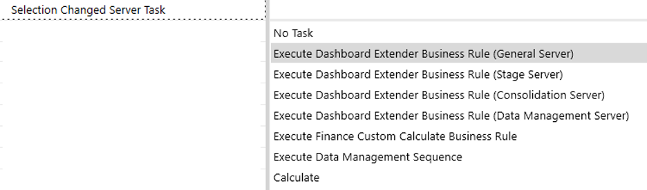
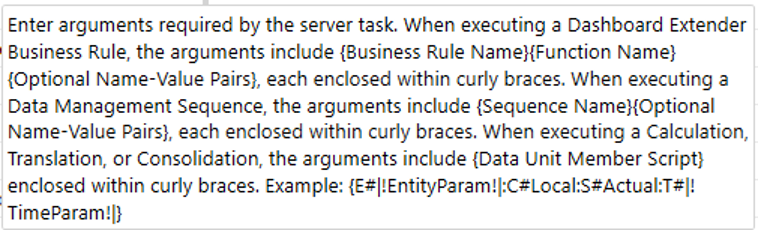
Server Task
Selection Changed Server Task can be configured for several actions, as shown in the picture below:
A common scenario is to set Server Task to “Execute Dashboard Extender Business Rule (General Server)” and for Selection Changed Server Task Arguments call a method and pass parameters, as shown in the picture below:
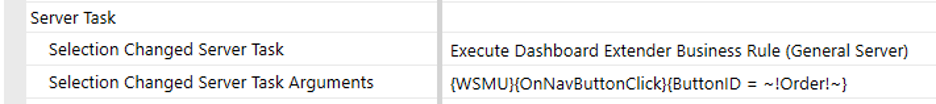
Using {WSMU} will search in the current Workspace as well in other Workspaces for that method name.
{WS} will search only in the current Workspace.
The code for that method is SvcComponent.cs services and it looks for that argument.
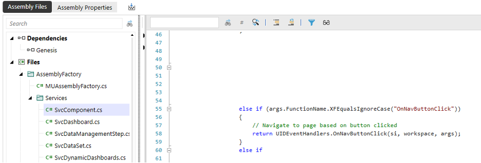
Then it calls the actual method which is in UIDEventHandlers class.
public static XFSelectionChangedTaskResult OnNavButtonClick(SessionInfo si, DashboardWorkspace workspace, DashboardExtenderArgs args)
{
    try
    {
        var taskResult = new XFSelectionChangedTaskResult();
        var buttonId = args.NameValuePairs.XFGetValue("ButtonId").XFConvertToInt();
        var nvpText = BRApi.Dashboards.Parameters.GetLiteralParameterValue(si, false, workspace.WorkspaceID, DynamicDashboardConstants.NVPACTION_BTN_PARAMETER);
        var buttonModelList = !string.IsNullOrEmpty(nvpText) ? JsonSerializer.Deserialize<List<ButtonModel>>(nvpText) : new List<ButtonModel>();

        if (buttonModelList[buttonId - 1].IsNavigate && !string.IsNullOrWhiteSpace(buttonModelList[buttonId - 1].NavText))
        {
            taskResult.ChangeSelectionChangedNavigationInDashboard = true;
            taskResult.ModifiedSelectionChangedNavigationInfo.SelectionChangedNavigationType = XFSelectionChangedNavigationType.OpenPage;
            taskResult.ModifiedSelectionChangedNavigationInfo.SelectionChangedNavigationArgs = buttonModelList[buttonId - 1].NavText;
        }

        return taskResult;

    }
    catch (Exception ex)
    {
        throw ErrorHandler.LogWrite(si, new XFException(si, ex));
    }
}
Selection Changed Server Task Arguments – the following is a list of other Task Arguments that can be added:
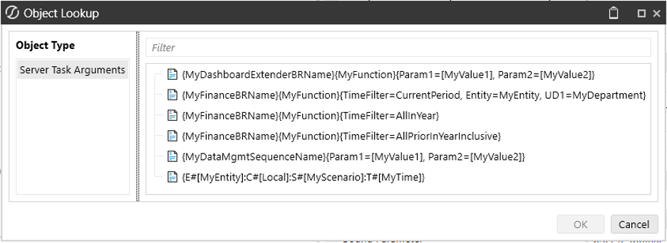
The syntax for the arguments is explained in the picture below:
User Interface Action
Selection Changed User Interface Action can be configured for several actions, as shown in the picture below:
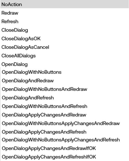
These actions can Redraw or Refresh a Dashboard, open or Close a Dialog that will show the OK or Cancel button.
- Refresh: This action requests new data from the server and updates the dashboard with the latest information. It ensures that all data displayed is current and accurate. When you refresh a dashboard, it may prompt for parameters again to fetch the updated data.
- Redraw: This action updates the visual elements of the dashboard without requesting new data from the server. It is useful for making changes to the layout or appearance of the dashboard without altering the underlying data.
In summary, use "Refresh" when you need to update the data displayed on the dashboard, and use "Redraw" when you only need to update the visual presentation.
When Selection Changed User Interface Action is configured, one of the following parameters needs to be setup:
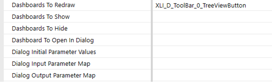
- For Dashboards, enter a comma delimited list of dashboard names.
- For Dialog Initial Parameter Values, enter a comma list of name-value pairs of parameter name and value.
Hover over each parameter and a ToolTip will display details.
Navigation Action
Selection Changed Navigation Action can be configured for several actions, as shown in the picture below:
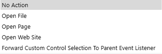
Selection Changed Navigation Arguments can be configured with the following syntax:
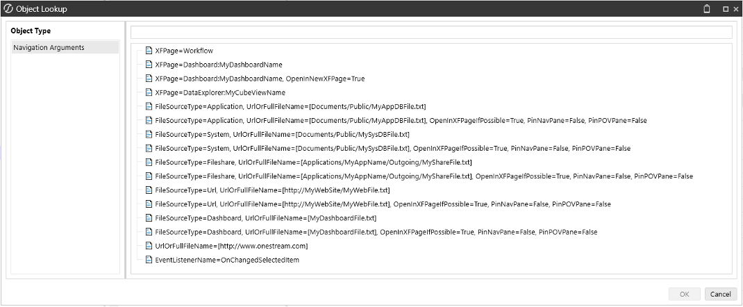
For example, to open a dashboard on a new page use this syntax: XFPage=Dashboard:MyDashboardName, OpenInNewXFPage=True and replace MyDashboardName.
If the dashboard you want to open is in another Workspace it needs to be shared.
Usage
Below is another example of code where a counter method IncrementCounter can be called from a standard button component. This class can be found in DTK_SolutionHelper.cs under Assemblies.
private static XFSelectionChangedTaskResult IncrementCount(SessionInfo si, DashboardExtenderArgs args)
{
    XFSelectionChangedTaskResult taskResult = SetReturnObject(si);

    string iv_CurrentCount_DTKCLC = args.NameValuePairs.XFGetValue("iv_CurrentCount_DTKCLC");

    // Increment counter implementation
    int currentCount = int.Parse(iv_CurrentCount_DTKCLC);
    currentCount++;
    string count = currentCount.ToString();

    // Set parameter and refresh dashboard
    taskResult.ModifiedCustomSubstVars.Add("iv_CurrentCount_DTKCLC", count);
    taskResult.ModifiedSelectionChangedUIActionInfo.SelectionChangedUIActionType = XFSelectionChangedUIActionType.Refresh;
    taskResult.ModifiedSelectionChangedUIActionInfo.DashboardsToRedraw = "2b_StandardButtonContentExample_DTKCLC";
    return taskResult;
}
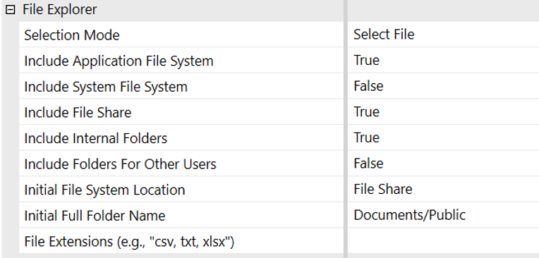
File Explorer Button
When the button type is set to File Explorer, it will launch a dialog box displaying the File Explorer, allowing the user to browse/select a file from the OneStream Application File System, System and File Share. Also, it can include folders for other users.
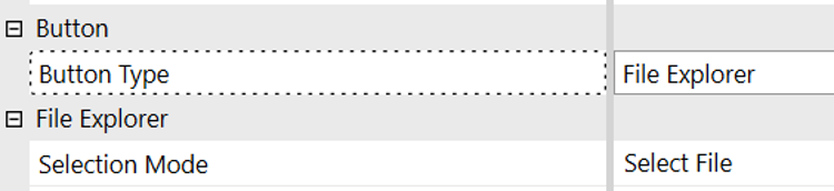
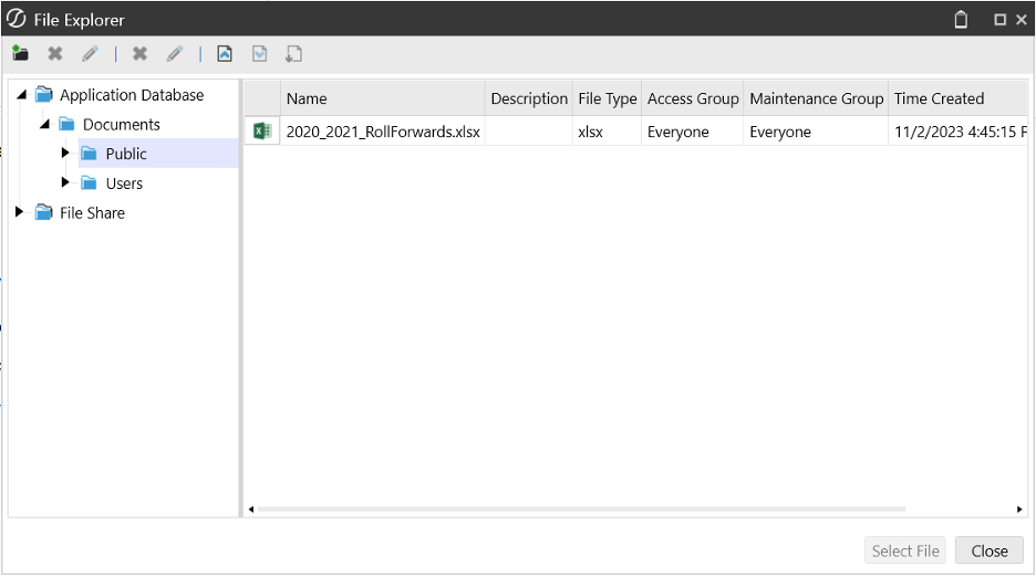
The button can be set to open a file or a folder by selecting the Selection Mode.

The File Explorer properties will allow the developer to limit what is displayed in the dialog, filter the file extensions or the location of the files.
Usage
The File Explorer Button can be added to a dashboard to open a file that can be displayed, or an image that can be assigned to another button or to an image control in a banner or footer of the page.
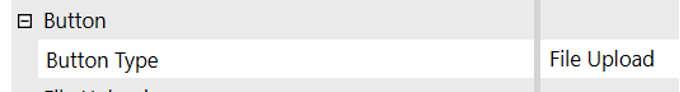
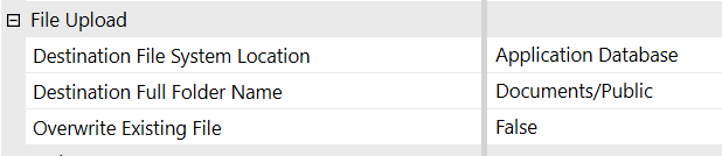
File Upload Button
When the button type is set to File Upload it will launch a Windows File Explorer displaying the user’s local folders and files. The user will be able to select a file to upload to the button’s specified destination folder name within the OneStream File System.
Usage
The File Upload Button can be used in a dashboard to upload files, documents or images to the internal OneStream File System that can be used in other dashboards to display/open those files or use images.
Select Member Button
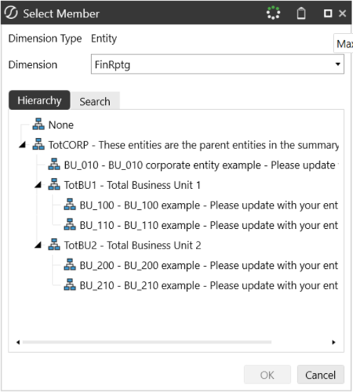
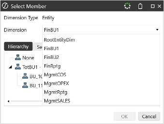
A select member button sets the button to display the Select Member dialog. The dialog can display members in a hierarchical format, allowing users to expand or collapse different levels. The users can select members from a specified dimension.
Properties
Set the Button Type to “Select Member”. New properties will be displayed.
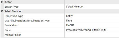
Dimension Type
There are two main types of dimensions:
-
Customizable Dimensions: These dimensions can be freely configured and include:
- Entity: It supports multiple hierarchies driven by reporting requirements, business processes, or responsibility structures Examples of hierarchies are geography, business unit, product, legal, tax, and regulatory reporting.
- Scenario: Represents different planning scenarios such as Actual, Budget, and Forecast data.
- Account: Represents the account structure.
- Flow: Represents the movement of data.
- User Defined Dimensions (UD1 to UD8): Custom dimensions for specific business needs
- Parent: They are driven by reporting standards such as business unit or geography
- Intercompany: The Intercompany (IC) dimension specifies which entities can be involved with intercompany activity. An Intercompany dimension member is populated when the Is IC Entity property is set to True on an Entity member.
- Consolidation: Used for consolidation processes.
- Time: Represents time periods.
-
System Dimensions: These are predefined and cannot be changed. They include:
- View: The View dimension allows users to analyze data from different perspectives.
- Origin: Represents the source of data
-
Use All Dimensions for Dimension Type: This property is used to determine if all dimensions should be displayed in the Select Member dialog. The default value is False. When this property is set to True, the Select Member dialog will display all dimensions for a Dimension Type.
-
Dimension: This property is used to select the dimension for which members will be displayed in the Select Member dialog for the selected cube. The default value is None, and the Dimension drop-down will display all dimensions available in the selected cube.
- When a dimension is selected, the Select Member dialog will display the dimensions in the selected cube. If left empty, the Dimension drop-down will display all dimensions available in the selected cube.
- For a list of dimensions, navigate to Application -> Cube -> Dimensions.
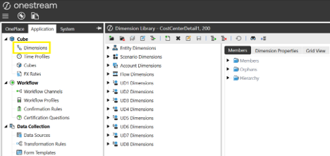
- When a dimension is selected, the Select Member dialog will display the dimensions in the selected cube. If left empty, the Dimension drop-down will display all dimensions available in the selected cube.
Tip: It doesn’t allow multiple dimensions.
- Cube: Enter a Cube name.
- Member Filter: Add a Member Filter formula (optional). This parameter will add more filtering options and you can build very complex formulas. Click the three-dot icon to display the Member Filter Builder dialog and build the formula.
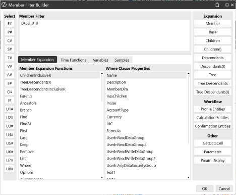
- For example, if we have selected an Entity for Dimension Type, in the Member Filter Builder we can select E#, and from Hierarchy we can select a business unit, for example BU_100. Then click the right arrow.
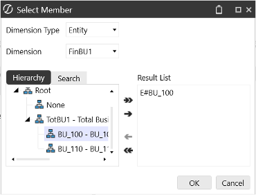
- Now, when you click the button, the Select Member dialog will display the filter formula, and the hierarchy will display only the items that meet that filter criteria.
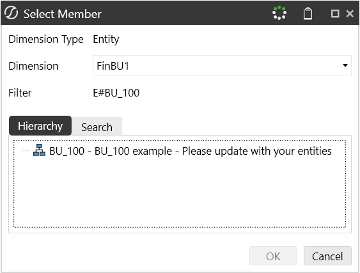
- For example, if we have selected an Entity for Dimension Type, in the Member Filter Builder we can select E#, and from Hierarchy we can select a business unit, for example BU_100. Then click the right arrow.
Usage
- The Select Member button can be used in a dashboard that displays financial data, and the users can select specific accounts or entities to view detailed reports or charts related to their selection.
- It can be used in a data entry to select the relevant department or region from a list.
- It can be used to generate custom reports based on specific criteria and the button allows users to select dimension members dynamically.
- It can be used in a Workflow approval for different business units. By clicking the button, users can select the business unit they are responsible for.
- It can be used for monitoring key performance indicators (KPIs) for various departments and the users can select the department or KPI they want to focus on.