Initial Data Validation - Dataset Page Insights
Introduction
During the beginning of an implementation, one of the most important steps is to understand the dataset to be worked on. While first steps may include understanding target hierarchies and conversions, or data sparsity and target counts, further analysis can be done during the first project builds in SensibleAI Forecast.
This guide seeks to address all of the insights available to an implementor after running the Dataset job in the initial Data section of a Model Build. Documenting and analyzing reported values will only need to be done once per dataset, but any time changes are made to the source data (target dimensions, frequency, filtering parameters, or mappings), the implementor should re-analyze the Dataset insights.
Dataset Overview Page
Let’s start with the top boxed row in the Dataset Overview.

In general, an implementor might use the number of features to verify that all intended features have been uploaded and committed, but otherwise, this value can be ignored. Similarly with the Frequency box, an implementor should confirm that SensibleAI Forecast is interpreting the dataset frequency in an expected way.
The number of targets, however, is critical to record. This will be directly communicated to the client and can affect future decisions of project segmentations or overlays, which would increase the target count. Furthermore, if the client wants to experiment additional use cases, implementors must balance the target counts with the environment target limits or communicate the need for an increase.
The total dates and unique dates box can inform the implementor of anomalies and ability to incorporate ML models or features. The Total Dates refers to the number of dates between the span of the earliest and latest dates in the data. In this case, there are 396 total weeks that exist between the start and stop date for actuals. On the other hand, Unique Dates refers to the number of non-missing dates in the data. For perfect datasets, these two numbers should be the same, so any mismatches inform the implementor that for certain periods, no actuals have been recorded across the entire datasets. This could be the case for IT-related issues, like systems failed to record for that period, or production related events, like no shipments will ever be sent during the week of Christmas. It becomes the implementor’s job to identify why that mismatch is occurring and strategize on whether events should be incorporated, or on handling missing actuals.
Finally, the magnitude of the number of dates can inform whether sufficient datapoints exist for feature utilization or ML model generation. This isn’t a perfect indicator, as it is possible that no target actually has history equal to the total number of dates.
Next, let’s consider the Target Group Information section.

The grouping method will be displayed, allowing for confirmation. Furthermore, all target groups will be listed, alongside the number of targets in each group. For this image, no grouping method was chosen, so all targets will be single targets. I find this readout particularly useful for understanding target counts when grouping by a higher-level category. For example, if I run a dataset with SKU, Customer, and Plant, by grouping by Customer or Plant, I can see the number of targets that are produced from a specific plant or that a customer orders. I typically ignore this section for initial data validation, as this is based on grouping parameters - not something inherent to the dataset. Perhaps I return to this section when experimenting with grouping strategies, but I won’t record anything during initial data validation.
Finally, let’s consider the Target Volatility Decomposition table.
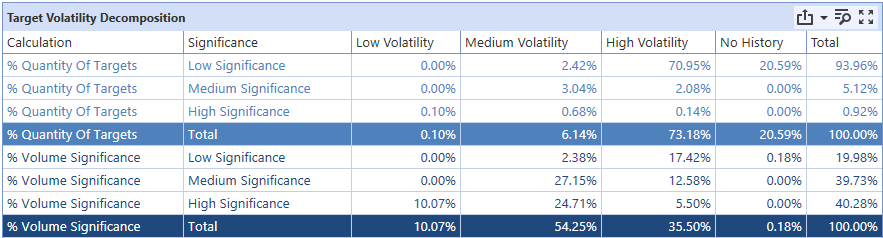
It can be daunting to try to analyze this table, but fortunately, there are some straightforward insights that can be drawn. First, by looking at the “Total” column, an implementor can weigh the impact that specific targets have on the dataset. One can craft the statement: “X% of [Size] Significance targets constitute X% of the total volume”. In this case, we see 93% of targets constitute the bottom 20% of total volume. Furthermore, only 1% of targets constitute the top 40% of total volume. Heavily stratified datasets like this can be a boon for implementors, as accuracy gains across the dataset can be gained by focusing on the small number of high significance targets. Typically, if a client has a small proportion of customers or products that constitute a large portion of their sales, then numbers like these can be expected. An implementor should identify these disproportionate targets for isolation in FVA analysis to understand where to improve model accuracy.
Next, we can consider the “No History” column to inform planning about project segmentation or grouping strategies. Targets with “no history” are targets with less than 5 data points present in the dataset. Generally, all no history targets will be low significance, because in general, data history length is the biggest contributor to significance, rather than individual order magnitude. In this case, about 1 out of every 5 low significance targets have no history. This can be concerning given low significance targets are 94% of the total target count. This means ~18% of all targets will have baseline (typically zero-model) models generated for them. An implementor might reconsider the dataset granularity (daily/weekly/monthly) to minimize the number of targets with no history. As an example, if a target came online 5 months ago, it likely has ~21 data points at the weekly level. Alternatively, grouping may be required so that zero-models are not predominantly generated for the no-history targets.
Lastly, I glance over the volatility numbers, looking for large numbers in medium and low volatility, as ML models can excel at modeling these types of data. I view the data volatility portion as a predictor for SensibleAI Forecast success with a given dataset. If a large number, or my important targets are all medium or low volatility, I can reasonably expect accurate predictions.
In general, high volatility or no history numbers might suggest a different target dimensionality or granularity for which to forecast; forecasting at a higher level (both time-wise and target hierarchy) might reduce the volatility in targets, while forecasting at a lower granularity might increase the number of datapoints, therefore reducing “no history” targets.
Dataset Aggregate Page
The top boxes on the Aggregate page repeat information shown in the Overview page. However, the Aggregate Target Time Series graph presents new information about overall dataset magnitude over time. I typically try to analyze this graph to identify major anomalies or level-set shifts that may reflect underlying data collection issues.
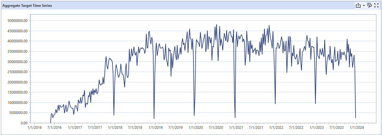
Using the above graph, an implementor might make the following observations. First, there are extremely large drop-offs during the week of Christmas; there’s an order of magnitude difference between “normal” operations and during the last week of December. Of course, a reasonable guess is to assume this is a result of Christmas shutdowns (prime example of holiday event incorporation), but it is imperative to confirm with the client. Large drops in the dataset could be indicative of data collection issues, which would directly impact data cleaning.
Next, another potential concern is the sharp difference between the 2016-2017 era and the rest of the dataset. Post-2018 is consistent in the magnitude of sales, while pre-2018 is around a quarter of the volume. Further exploration with the client could that certain channels came online after 2018 (whether due to a new acquisition, or a change in data storage location). This insight reveals that the majority of volume comes online after 2018, despite having a dataset that goes to 2016. Because of the change in history between targets, implementors might consider project segmentation, or asking the client for history of channels or divisions stored in older locations.
Moving to the graph below, we see a histogram where the percentage of targets missing a value for a specific date.
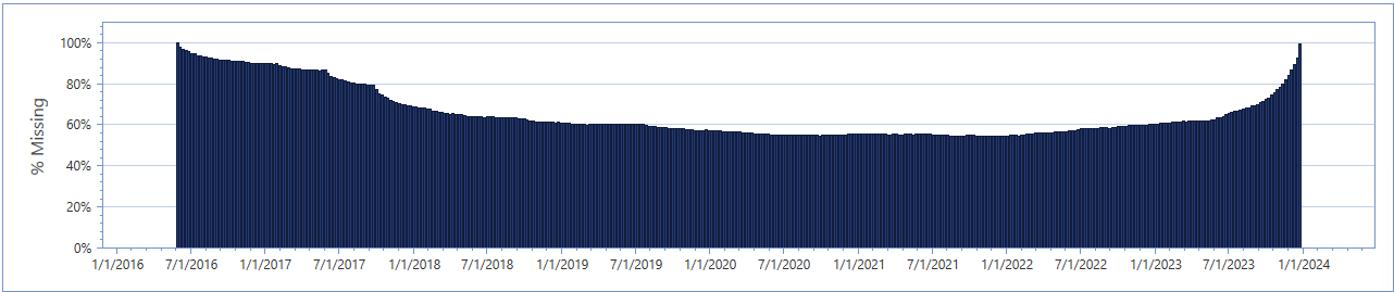
In a similar manner to the Aggregate Target Time Series graph covered earlier, this chart can expose data collection issues, especially if there are any anomalous patterns. In this example, notice the consistency within the post-2018 period compared to the large number of missing targets pre-2018. This aligns with the conclusions made earlier than certain target subsets come online only during 2018. Furthermore, consider the uptick during 2023. This period will need to be questioned to the client. Perhaps this is indicative of a large number of targets shutting off, or due to a concerningly large collection lag.
Finally, an implementor must weigh the missing density versus the expected benefit of the time frequency. Given that this dataset is weekly and on average, each week has missing entries (0 values) for 60% of targets. This means that any given target is expected to see sales once every other week, which can reduce predictive accuracy due to the large and frequent amount of zero-values expected. An implementor might weigh the tradeoff between having the feature and event impact that weekly datasets offer with the data fullness that a monthly dataset could offer. Sometimes decisions like this may be out of the implementors control; this dataset doesn’t have enough history for ML model generation at the monthly level.
Dataset Advanced Page
Finally, the Advanced page shows several metrics and graphs that can be used to predict forecasting success. The second row of boxes report on the forecastability, seasonality, stationarity, and trend of the dataset.

Forecastability refers to the extent to which accurate predictions can be made about a time series. It is influenced by the series' properties and the presence of patterns or regularities that can be learned by forecasting models. A highly forecastable series is one where future values can be predicted with a high degree of accuracy based on past values.
Seasonality indicates the presence of regular and predictable patterns or fluctuations in a time series that occur at specific regular intervals, such as daily, weekly, monthly, or annually. For example, retail sales might increase significantly during the holiday season each year, reflecting annual seasonality.
A time series is considered stationary if its statistical properties, such as mean, variance, and autocorrelation, are constant over time. Stationarity is a crucial concept because many forecasting models assume or require the time series data to be stationary to make accurate predictions.
The trend in a time series refers to a long-term increase or decrease in the data. It represents the overall direction in which the series is moving over time.
In general, higher forecastability and may yield better overall accuracy. High seasonality and trend may show greater feature impact. Furthermore, high stationarity may yield better success with certain types of models that require stationarity as a precondition.
Next, the Percent of Total Targets by Historical Actual Count can be analyzed to identify the number of datapoints per target across the dataset. This view gives some of the same information as the “No History” column in the Target Volatility Decomposition table, but is more in depth.
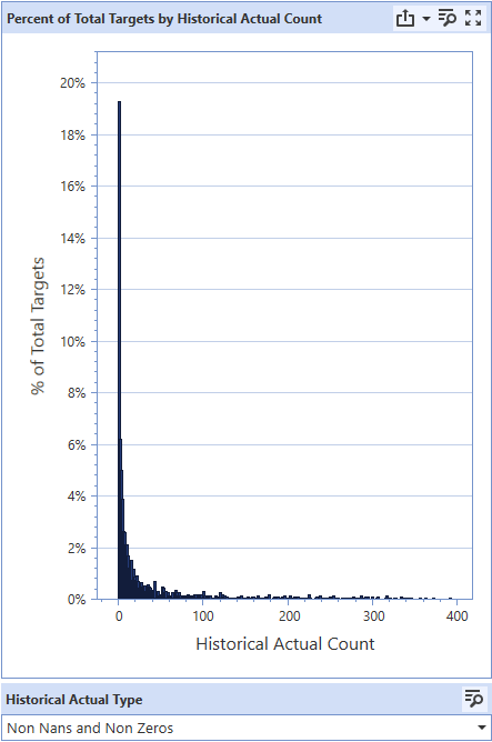
Ideal datasets will have a large concentration of targets on the upper end of the actual account (left skewed), as a majority of targets will have the full history of data to work from. The example graph indicates a high proportion of targets with little to no historical actuals. Most models will not be ML models and a large portion will not be able to leverage features or events. This could be the result of a couple of things, and would require deeper exploration, but this could be because of extreme data sparsity for targets or a large amount of “new” targets. Aggregating the data to a higher level of target hierarchy or to a higher time frequency may help. High proportions of targets with low actuals counts is very concerning and can significantly hinder accuracy. This may be an example of the need to return to the client and modify forecasting requirements, either by demanding for more data, or forecasting at a different dimensionality.
Finally, a glance at the Global Target Absolute PACF graph can yield insights on the effect of seasonality in the dataset. PACF stands for Partial Autocorrelation Function and this graph measures how correlated an observed data point is with the data from X periods ago (a lag of X).
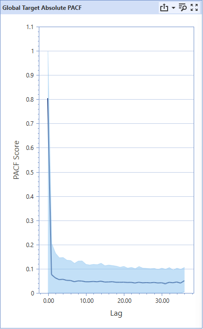
Ignoring the lag of 0 (current observation), there are no sharp spikes that indicate a high degree of autocorrelation. As an example of expected spikes in the autocorrelation values are in daily datasets for restaurant orders. Typically, the greatest predictor for the day’s current sales are the average sales for that day of the week. In this case, there will be large spikes for lags of 7, 14, 21, 28, etc., as that number of days previously fall on the same day of the week. In a summarized sentence, last week’s value is a good predictor of this week’s value.
Strategically, one wants to have a forecast horizon shorter than any large autocorrelation spikes in the graph. This way, the lagged value will be incorporated into future predictions. Sometimes, this isn’t possible because the client requires a minimum forecast length.
Returning to the sample graph, there is a noticeable consistent downwards trend, indicating that recent sales are more correlated with today’s sales than sales from a long time ago. Unfortunately, this is about as much insight as one can gain from the graph of this dataset. The existence of any spikes allow more of a nuanced interpretation and facilitates future exploration on why the seasonality of the dataset presents occurs with the specific lagged periods.
Conclusion
The insights reported by the Dataset Overview pages after completing the Dataset job in the Model Build phase of SensibleAI Forecast can equip an implementor with a deeper understanding of the dataset that can predict dataset success and inform the implementor on data quality issues regarding sparsity, significance distribution, and the existence of anomalies and seasonality. I always recommend to perform a deep dive on the Dataset Overview analytics after preliminary data exploration, but fortunately this only needs to be completed once per dataset. Remember that any changes made to the target data, whether on dimensionality or filtering parameters, should require another look into the Overview analytics.